TOOCH

Projects
Engage 3.0: The Next Chapter
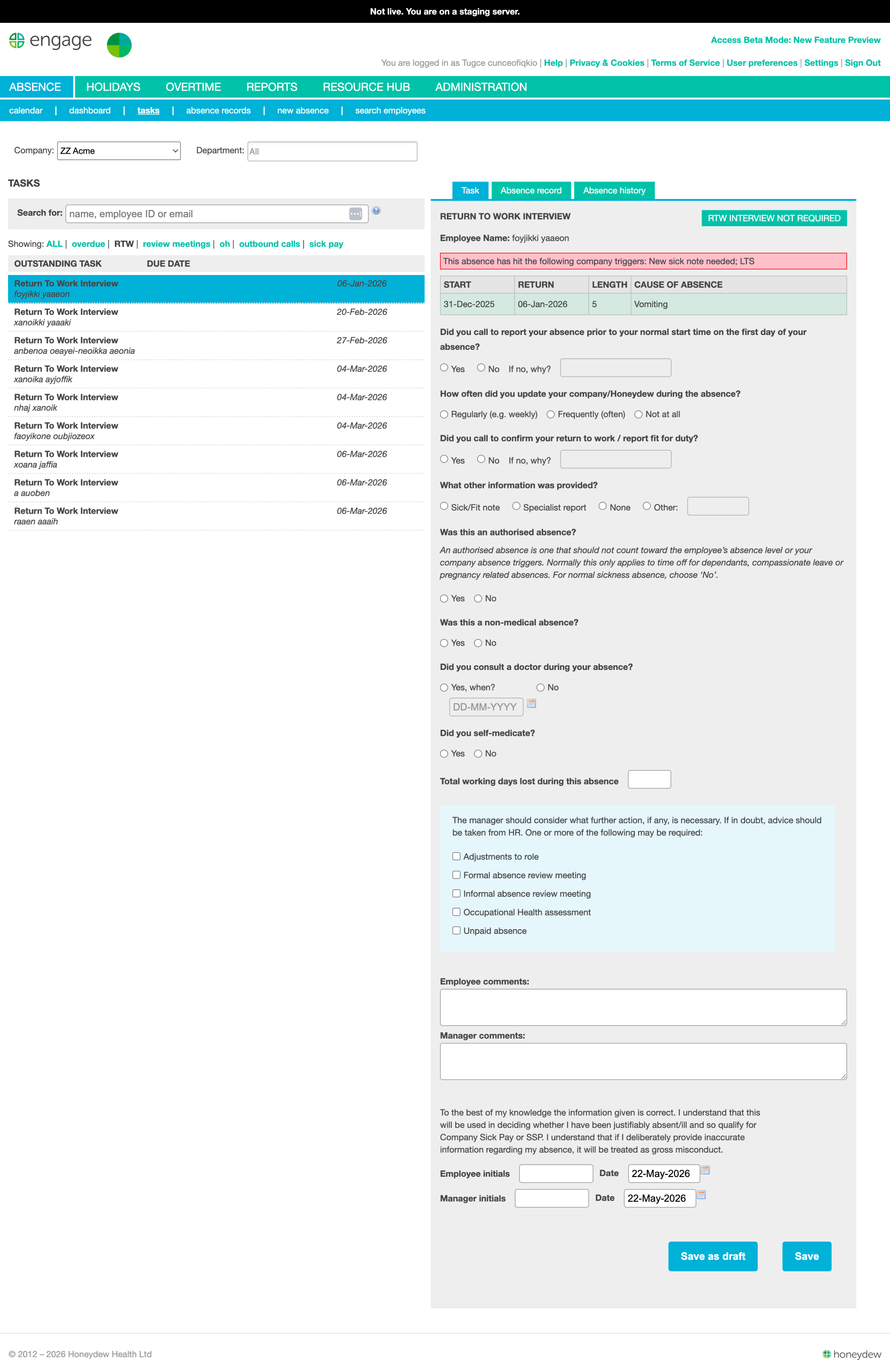
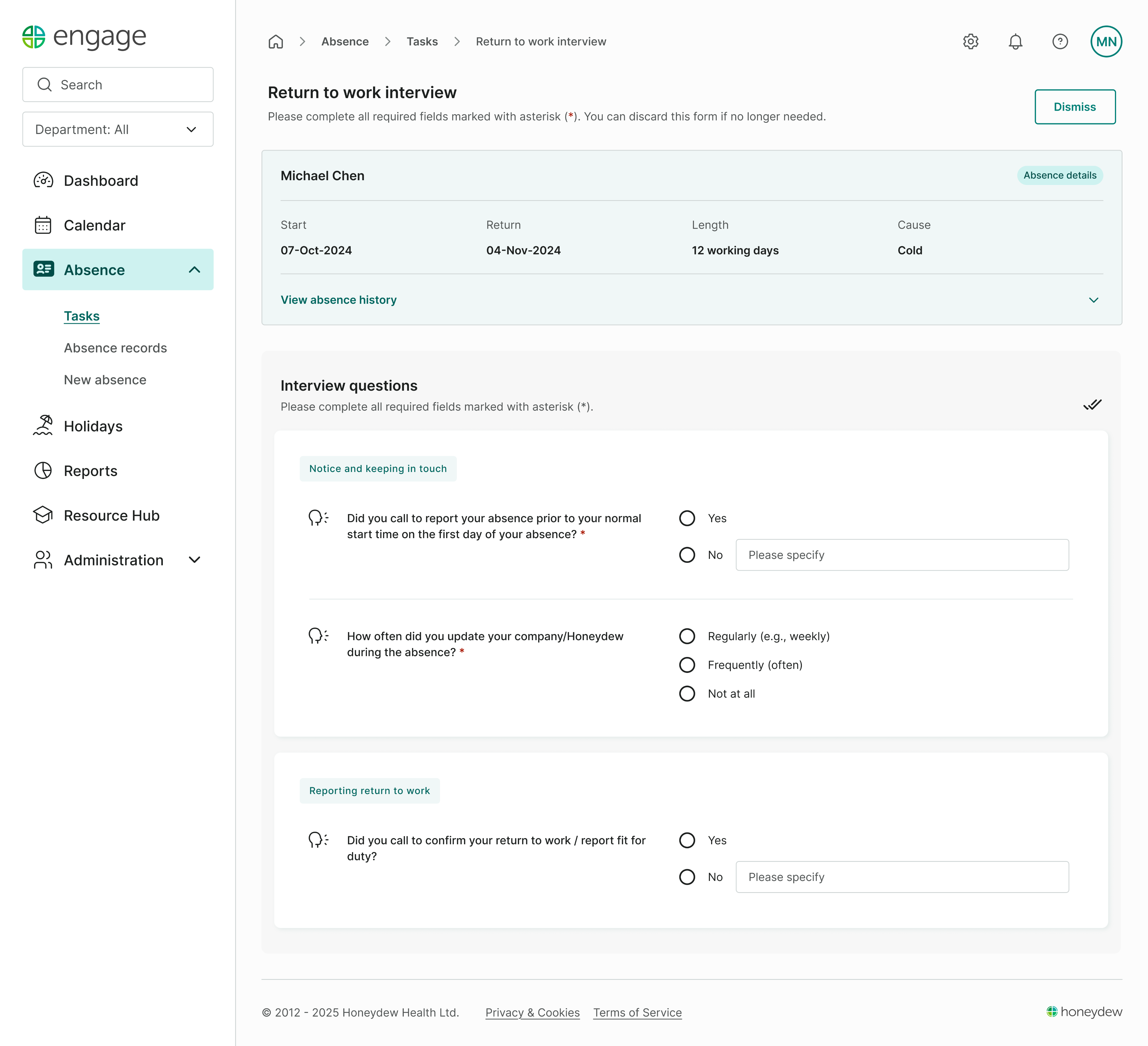
Twelve years of continuous development had shaped Engage into a capable product, but it was showing its age. This redesign was an opportunity to simplify workflows, modernise the interface and make the platform work just as well on mobile as it did on desktop.
12+ months
Solo designer
Product trio
11k users managing 260k employees
UAT

ROLE
Sole product designer
TEAM
PM, engineer and me
USERS
HR teams, call handlers, line managers
SCOPE
Research, IA, UI, design system
TIMELINE
12+ months
OVERVIEW
Engage is Honeydew's flagship absence management platform, used by HR teams, call handlers and line managers across the UK.
After twelve years of incremental development, the product had accumulated a mix of patterns and workarounds along the way. Rather than starting again, the goal was to modernise the experience while preserving the workflows users already knew.
As the sole designer in a small product team, I led the redesign while the existing product continued to evolve. The work spanned research, information architecture, interaction design and visual design, alongside the introduction of a design system to make the new patterns reusable.

A few decisions that shaped the redesign
Engage is a large product, and the redesign has evolved over more than a year. Rather than document every screen and iteration, following are a few of the problems that changed how we thought about the product.
01

Managers on factory floors. Software stuck at the desk.
Making return-to-work forms mobile friendly was already on the roadmap when I joined Honeydew. One of our clients had been asking for a way for managers to complete them on the go, rather than having to return to a desk after the conversation.
A visit to another client gave us a better sense of why this mattered. Their managers worked across the factory floor and were using Engage alongside their day-to-day work. We watched managers carrying laptops around the site simply to access the platform.
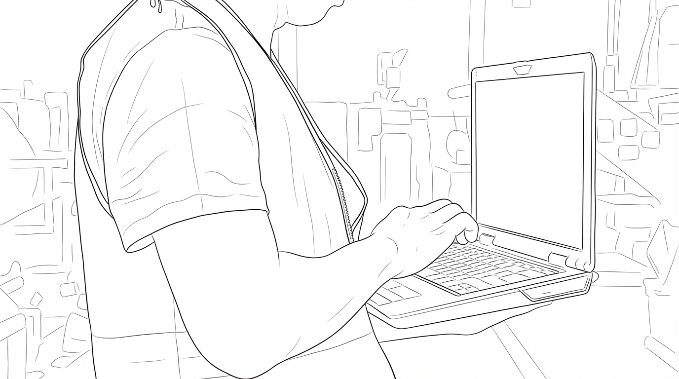
Illustrating how managers use Engage in operational environments beyond the traditional office. Generated with Figma AI, as photography of the premises wasn’t permitted.
The use case was clear: managers didn't necessarily need a mobile version of the whole product, but they did need to be able to complete key tasks away from a desk. Return-to-work interviews were a natural place to start, as they're intended to happen face-to-face on an employee's first day back. So mobile became one of the requirements shaping the wider redesign, rather than a separate mobile app of Engage. We designed the new experience responsively from the start, with forms as one of the first areas to tackle.
ALSO FROM ENGAGE
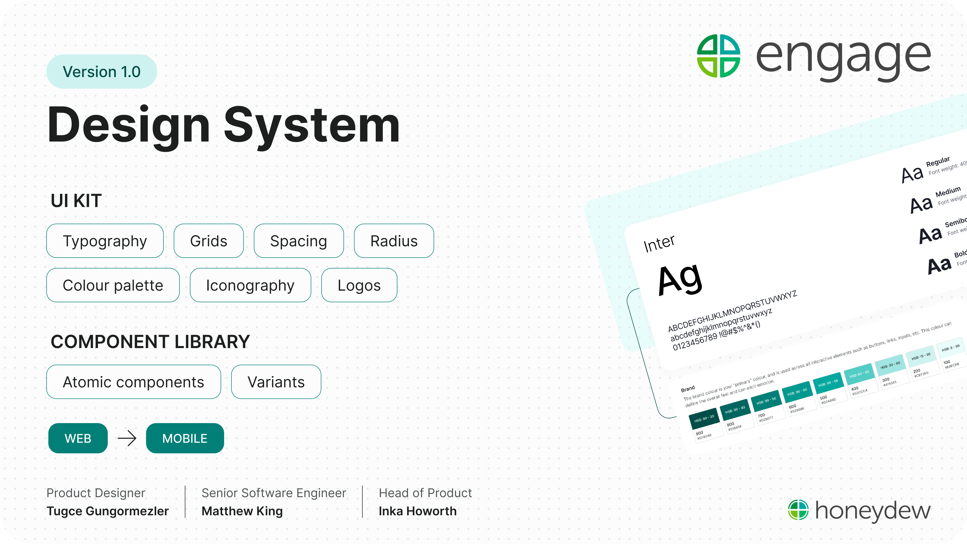
The system behind the redesign
How Engage got its first shared foundations, components and docs, built in step with the new screens.
→
02
Four ways to find the same person.
We started with a simple question: when a manager opens Engage, what are they actually looking for—a task, an absence, or an employee?
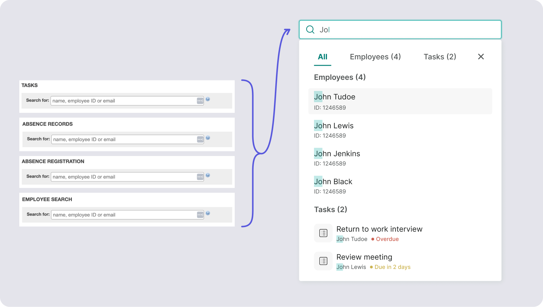
Engage had gradually become organised around features, while managers naturally thought about people. They could search from Tasks, Absence Records or Employee Search, but each journey assumed they already knew where the employee sat in the system. Had they returned to work? Was there an outstanding task? Were they currently absent? The product expected managers to answer those questions before it could help them.




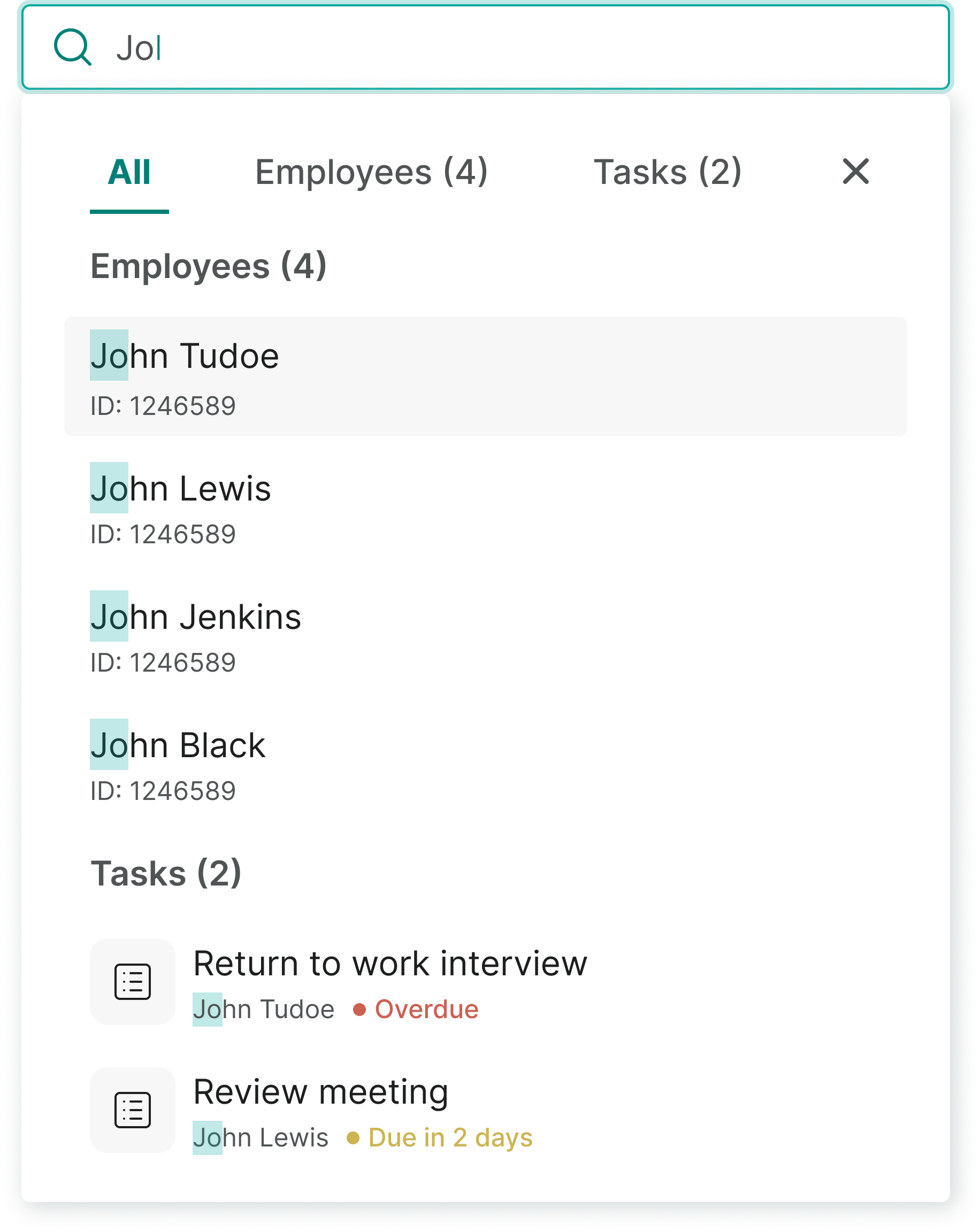


For someone managing a small team, that wasn't always a problem. For managers responsible for 50 or more employees, it became another thing to remember.
The question became less about where to search and more about what managers were trying to find.
Rather than adding another search, we stepped back and rethought the journey. A global search became the starting point, leading to a new employee profile that brought the relevant context together—current and historical absences, outstanding tasks, holidays and absence patterns. Managers could start with the person, rather than having to decide which feature to search first.
03
Different users, different needs.
Once we had re-centred the experience around the employee, a different question emerged: were we still asking every user to work in the same way?
Honeydew offers an outsourced absence reporting service for enterprises through a partner call centre. When an employee calls in sick, a call handler records the absence in Engage, which automatically notifies their manager.
Call handler workflow
3 Steps

Employee calls in
Reports absence


Call handler records
in Engage

Manager notified
Automatically
Although both the call handlers and line managers used the same product, they approached it from completely different starting points.
Managers already knew who they were speaking to, but call handlers didn't. Before they could record an absence, they first needed to be confident they had identified the correct employee—often while speaking to someone who was unwell, a relative calling on their behalf, or someone with only partial information.
The existing workflow treated both users the same. Identity checks relied heavily on the call handler deciding which questions to ask and when to stop searching. If they couldn't confidently verify the caller, the absence couldn't be recorded and a DPA Not Passed Report a Problem (RAP) was raised for Honeydew to investigate. That often meant repeat calls from employees and manual investigation by Honeydew's admin team.
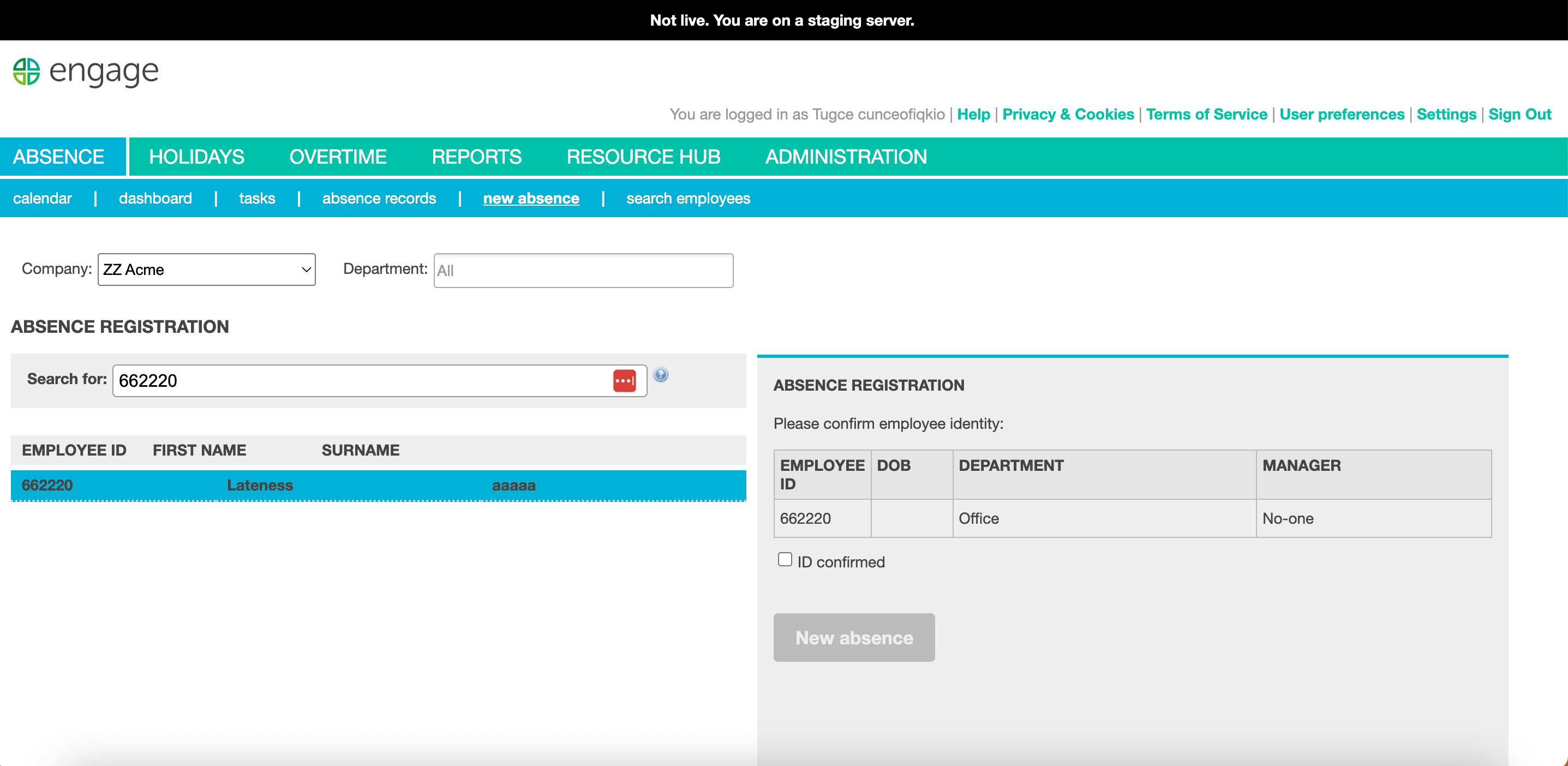
Rather than adapting the manager journey, we designed a dedicated flow for the call centre. Identity verification became a guided process, with questions rewritten and ordered to progressively narrow down the correct employee. The system led call handlers through each step, adapting the questions as new information became available. Only once every reasonable option had been exhausted did it offer the ability to raise a RAP.
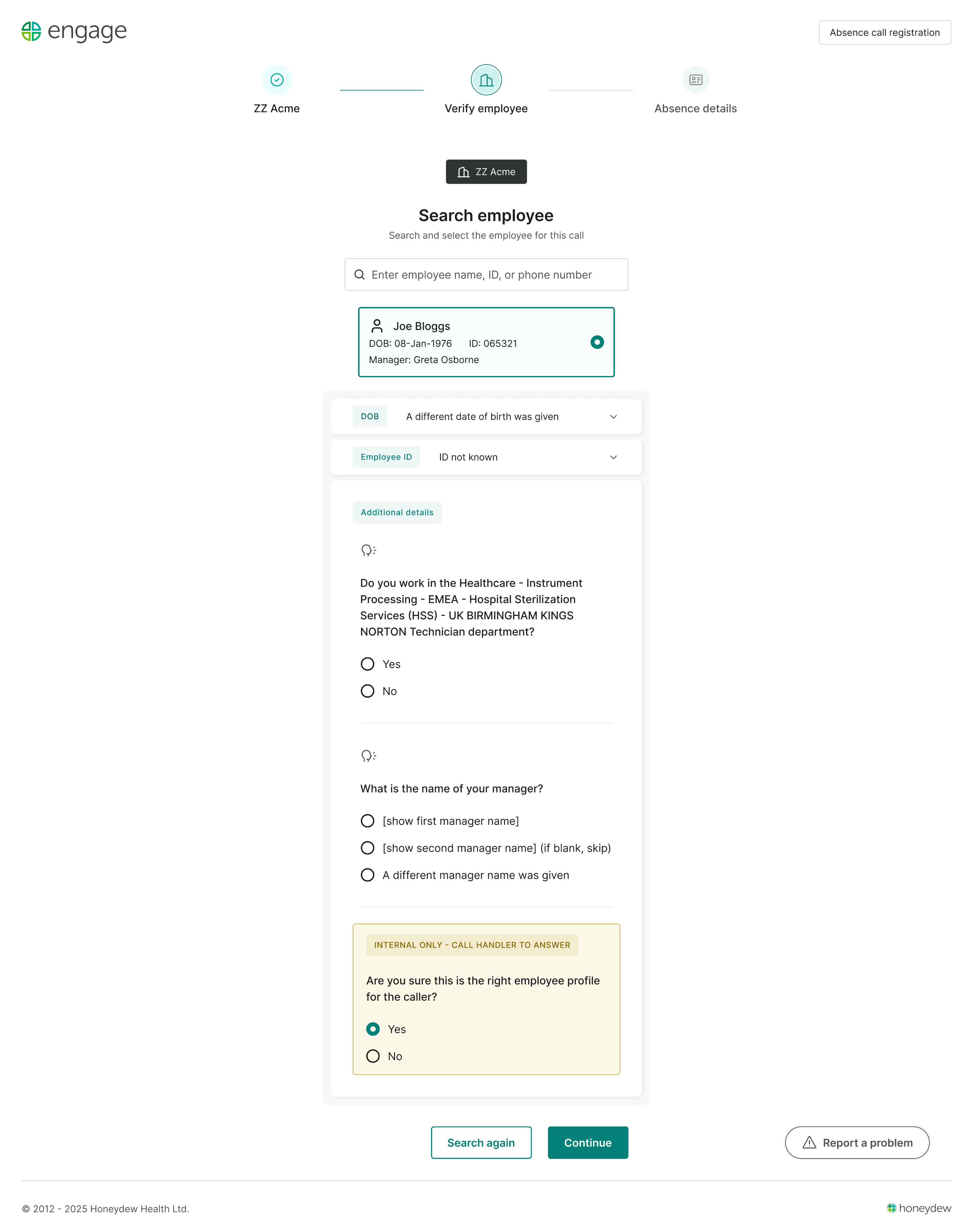
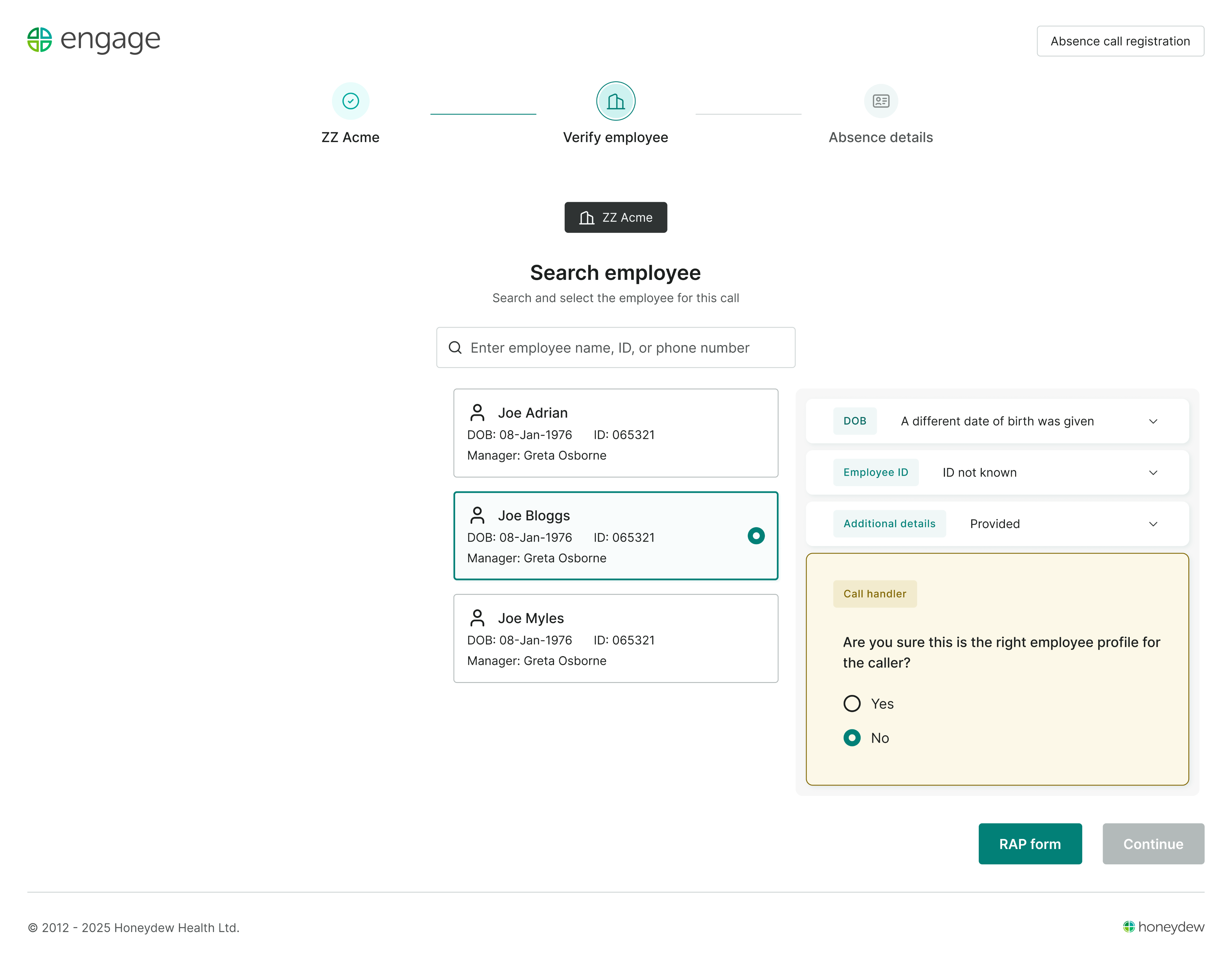
Our original hypothesis was that separating the workflows would reduce call handling time and simplify training. Those outcomes are still being measured as the beta rollout continues. The clearest impact so far has been elsewhere: the number of DPA Not Passed RAPs dropped almost immediately. It wasn't the metric we set out to improve, but it showed that helping call handlers verify identities more reliably removed a significant source of friction for both customers and Honeydew's support team.

WHAT CHANGED?
With the guided check in place,
RAP forms dropped from
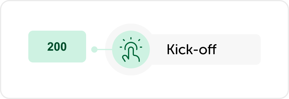
200+ to
145
and long calls
from
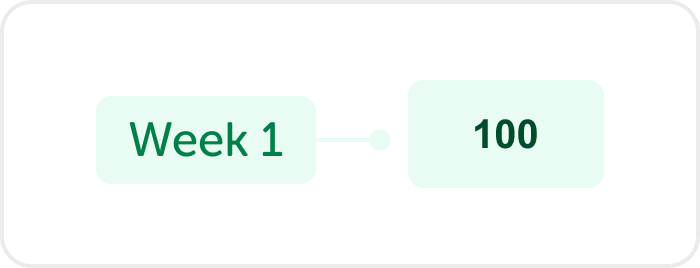
41 to
30
.

Where are we now?
The redesigned experience is now available as an opt-in beta for customers. Over the coming months it will become the default experience while still allowing users to switch back if needed. The gradual rollout is giving us the opportunity to validate decisions with real users before fully replacing the existing interface.
The project has achieved its original technical goal: transforming a desktop-first application into a responsive product with a modern design system. The bigger challenge now is learning from real usage and continuing to refine the experience as adoption grows.
More from my time at Honeydew
Alongside this work, I also refreshed Honeydew’s brand identity and built the design system that supported the wider redesign.


Honeydew Brand Refresh
Evolving Honeydew’s identity into a cohesive brand family, refining the logo and building shared guidelines and assets.
30+
guideline pages
10+
templates
3
identities using the system
Brand strategy
Logo design
Brand guidelines
Asset library
Engage Design System
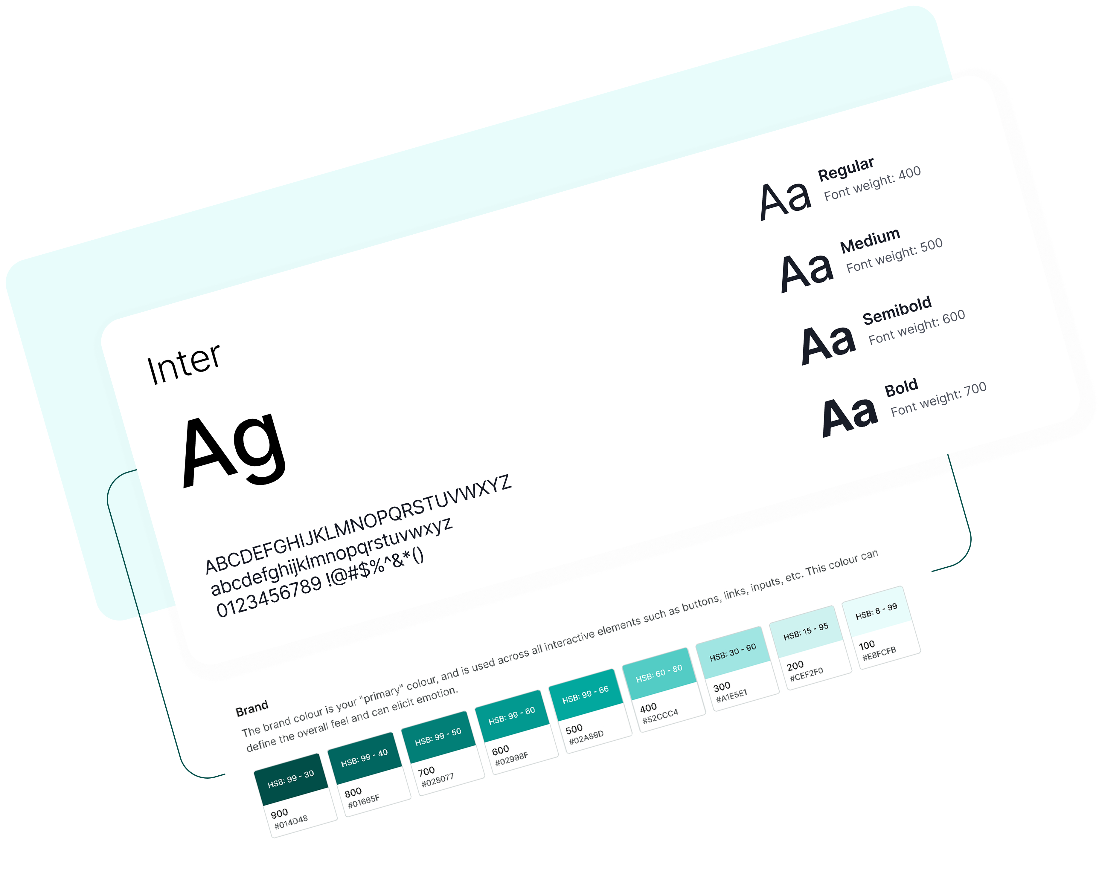
Setting up Engage's first design system: foundations, components and documentation, built alongside the redesign.
7
foundations
50+
components
100+
screens using the system
Design systems
Component library
Documentation
Figma
That’s a little about me and how I work
If you’d like to work together, compare notes or talk through a tricky product problem, you can find me at
TOOCH

© 2026 TUGCE GUNGORMEZLER

Product designer
Oxfordshire, UK
Remote-first, happy to travel for workshops and team sessions
TOOCH
Projects
Engage 3.0: The Next Chapter
Twelve years of continuous development had shaped Engage into a capable product, but it was showing its age. This redesign was an opportunity to simplify workflows, modernise the interface and make the platform work just as well on mobile as it did on desktop.
12+ months
Solo designer
Product trio
11k users managing 260k employees
UAT
ROLE
Sole product designer
TEAM
PM, engineer and me
USERS
HR teams, call handlers, line managers
SCOPE
Research, IA, UI, design system
TIMELINE
12+ months
OVERVIEW
Engage is Honeydew's flagship absence management platform, used by HR teams, call handlers and line managers across the UK.
After twelve years of incremental development, the product had accumulated a mix of patterns and workarounds along the way. Rather than starting again, the goal was to modernise the experience while preserving the workflows users already knew.
As the sole designer in a small product team, I led the redesign while the existing product continued to evolve. The work spanned research, information architecture, interaction design and visual design, alongside the introduction of a design system to make the new patterns reusable.
A few decisions that shaped the redesign
Engage is a large product, and the redesign has evolved over more than a year. Rather than document every screen and iteration, following are a few of the problems that changed how we thought about the product.
01
Managers on factory floors. Software stuck at the desk.
Making return-to-work forms mobile friendly was already on the roadmap when I joined Honeydew. One of our clients had been asking for a way for managers to complete them on the go, rather than having to return to a desk after the conversation.
A visit to another client gave us a better sense of why this mattered. Their managers worked across the factory floor and were using Engage alongside their day-to-day work. We watched managers carrying laptops around the site simply to access the platform.
Illustrating how managers use Engage in operational environments beyond the traditional office. Generated with Figma AI, as photography of the premises wasn’t permitted.
The use case was clear: managers didn't necessarily need a mobile version of the whole product, but they did need to be able to complete key tasks away from a desk. Return-to-work interviews were a natural place to start, as they're intended to happen face-to-face on an employee's first day back. So mobile became one of the requirements shaping the wider redesign, rather than a separate mobile app of Engage. We designed the new experience responsively from the start, with forms as one of the first areas to tackle.
ALSO FROM ENGAGE
The system behind the redesign
How Engage got its first shared foundations, components and docs, built in step with the new screens.
→
02
Four ways to find the same person.
We started with a simple question: when a manager opens Engage, what are they actually looking for—a task, an absence, or an employee?
Engage had gradually become organised around features, while managers naturally thought about people. They could search from Tasks, Absence Records or Employee Search, but each journey assumed they already knew where the employee sat in the system. Had they returned to work? Was there an outstanding task? Were they currently absent? The product expected managers to answer those questions before it could help them.
For someone managing a small team, that wasn't always a problem. For managers responsible for 50 or more employees, it became another thing to remember.
The question became less about where to search and more about what managers were trying to find.
Rather than adding another search, we stepped back and rethought the journey. A global search became the starting point, leading to a new employee profile that brought the relevant context together—current and historical absences, outstanding tasks, holidays and absence patterns. Managers could start with the person, rather than having to decide which feature to search first.
03
Different users, different needs.
Once we had re-centred the experience around the employee, a different question emerged: were we still asking every user to work in the same way?
Honeydew offers an outsourced absence reporting service for enterprises through a partner call centre. When an employee calls in sick, a call handler records the absence in Engage, which automatically notifies their manager.
Call handler workflow
3 Steps
Employee calls in
Reports absence

Call handler records
in Engage
Manager notified
Automatically
Although both the call handlers and line managers used the same product, they approached it from completely different starting points.
Managers already knew who they were speaking to, but call handlers didn't. Before they could record an absence, they first needed to be confident they had identified the correct employee—often while speaking to someone who was unwell, a relative calling on their behalf, or someone with only partial information.
The existing workflow treated both users the same. Identity checks relied heavily on the call handler deciding which questions to ask and when to stop searching. If they couldn't confidently verify the caller, the absence couldn't be recorded and a DPA Not Passed Report a Problem (RAP) was raised for Honeydew to investigate. That often meant repeat calls from employees and manual investigation by Honeydew's admin team.
Rather than adapting the manager journey, we designed a dedicated flow for the call centre. Identity verification became a guided process, with questions rewritten and ordered to progressively narrow down the correct employee. The system led call handlers through each step, adapting the questions as new information became available. Only once every reasonable option had been exhausted did it offer the ability to raise a RAP.
Our original hypothesis was that separating the workflows would reduce call handling time and simplify training. Those outcomes are still being measured as the beta rollout continues. The clearest impact so far has been elsewhere: the number of DPA Not Passed RAPs dropped almost immediately. It wasn't the metric we set out to improve, but it showed that helping call handlers verify identities more reliably removed a significant source of friction for both customers and Honeydew's support team.
WHAT CHANGED?
With the guided check in place,
RAP forms
dropped from 200+ to
145
and long calls from
41 to
30
.
Where are we now?
The redesigned experience is now available as an opt-in beta for customers. Over the coming months it will become the default experience while still allowing users to switch back if needed. The gradual rollout is giving us the opportunity to validate decisions with real users before fully replacing the existing interface.
The project has achieved its original technical goal: transforming a desktop-first application into a responsive product with a modern design system. The bigger challenge now is learning from real usage and continuing to refine the experience as adoption grows.
More from my time at Honeydew
Alongside this work, I also refreshed Honeydew’s brand identity and built the design system that supported the wider redesign.
Engage Design System
Setting up Engage's first design system: foundations, components and documentation, built alongside the redesign.
7
foundations
50+
components
100+
screens using the system
Design systems
Component library
Documentation
Figma
Honeydew Brand Refresh
Evolving Honeydew’s identity into a cohesive brand family, refining the logo and building shared guidelines and assets.
30+
guideline pages
10+
templates
3
identities using the system
Brand strategy
Logo design
Brand guidelines
Asset library
That’s a little about me and how I work
If you’d like to work together, compare notes or talk through a tricky product problem, you can find me at
TOOCH

© 2026 TUGCE GUNGORMEZLER
Product designer
Oxfordshire, UK
Remote-first, happy to travel for workshops and team sessions