TOOCH
Projects
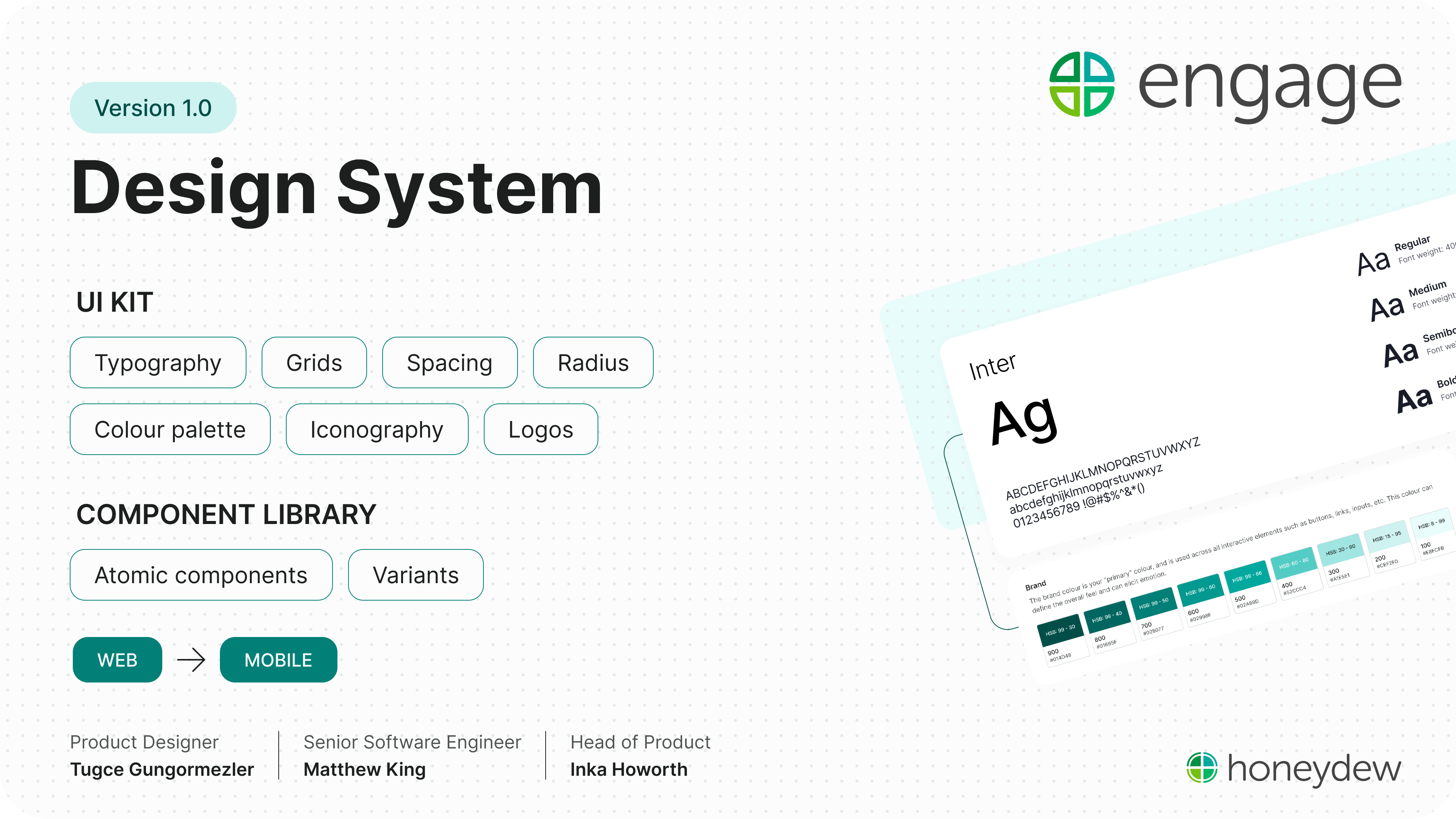
Engage Design System
Two weeks for the foundations. Twelve months to prove the value.
Component library
Solo designer
Product trio
1234 users
Dev hand-off
ROLE
Sole product designer
TEAM
Engineer and me
USERS
The product trio, augmented by Claude
SCOPE
Variables, tokens, components, templates
TIMELINE
Nov 2025
THE CONTEXT
Engineering identified growing technical risk in the 12-year-old product and proposed a year-long modernisation initiative.
Alongside migrating the front end to Bootstrap, I was the sole designer responsible for redesigning the product while simultaneously creating the design system that would support it.

The first piece of the puzzle
Forms were the backbone of Engage, supporting everything from absence reporting to occupational health assessments. As the most frequently used part of the platform, they offered the greatest opportunity to improve UX and establish reusable design patterns for the wider system.
01

Taming unpredictable forms
The existing forms were largely unstyled HTML, with little visual hierarchy or structure. As users answered questions, additional fields would appear without any indication of why they had been revealed or how they related to the previous answer. The form continuously changed shape, making it difficult to understand what had triggered new questions or when a section was actually complete.
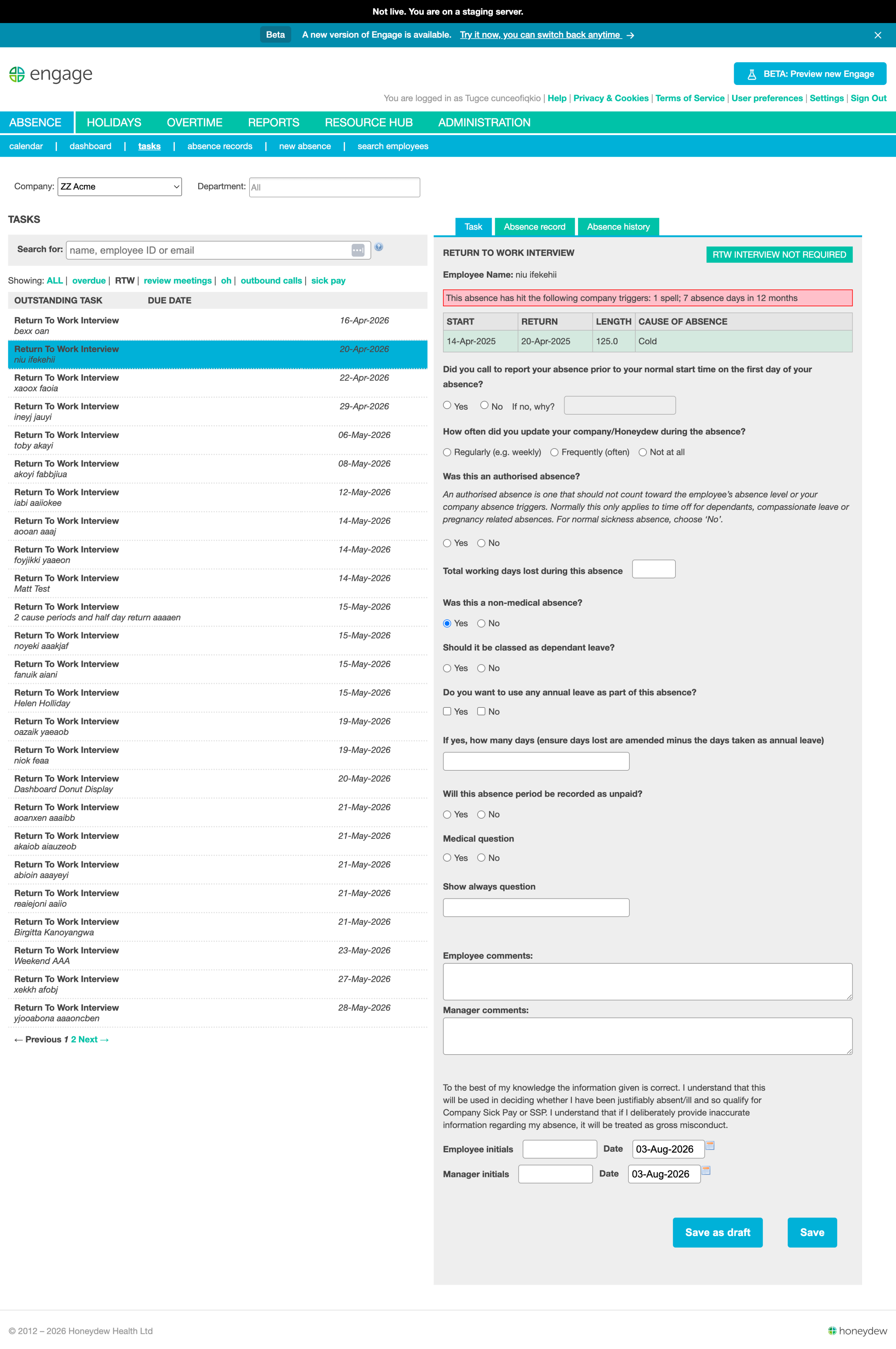
Example of a nested question in the legacy system, with no visual indication of its hierarchy and an inappropriate use of checkboxes.
02

Designing how forms behave
Rather than redesigning individual forms, I focused on designing how forms behave. By identifying the structure shared across every workflow, I created a flexible fieldset component that introduced section labels, grouped related questions and established a clear pattern for conditional inputs. Nested questions were visually connected to their parent using a vertical guide, making it immediately obvious when an answer had triggered additional information.
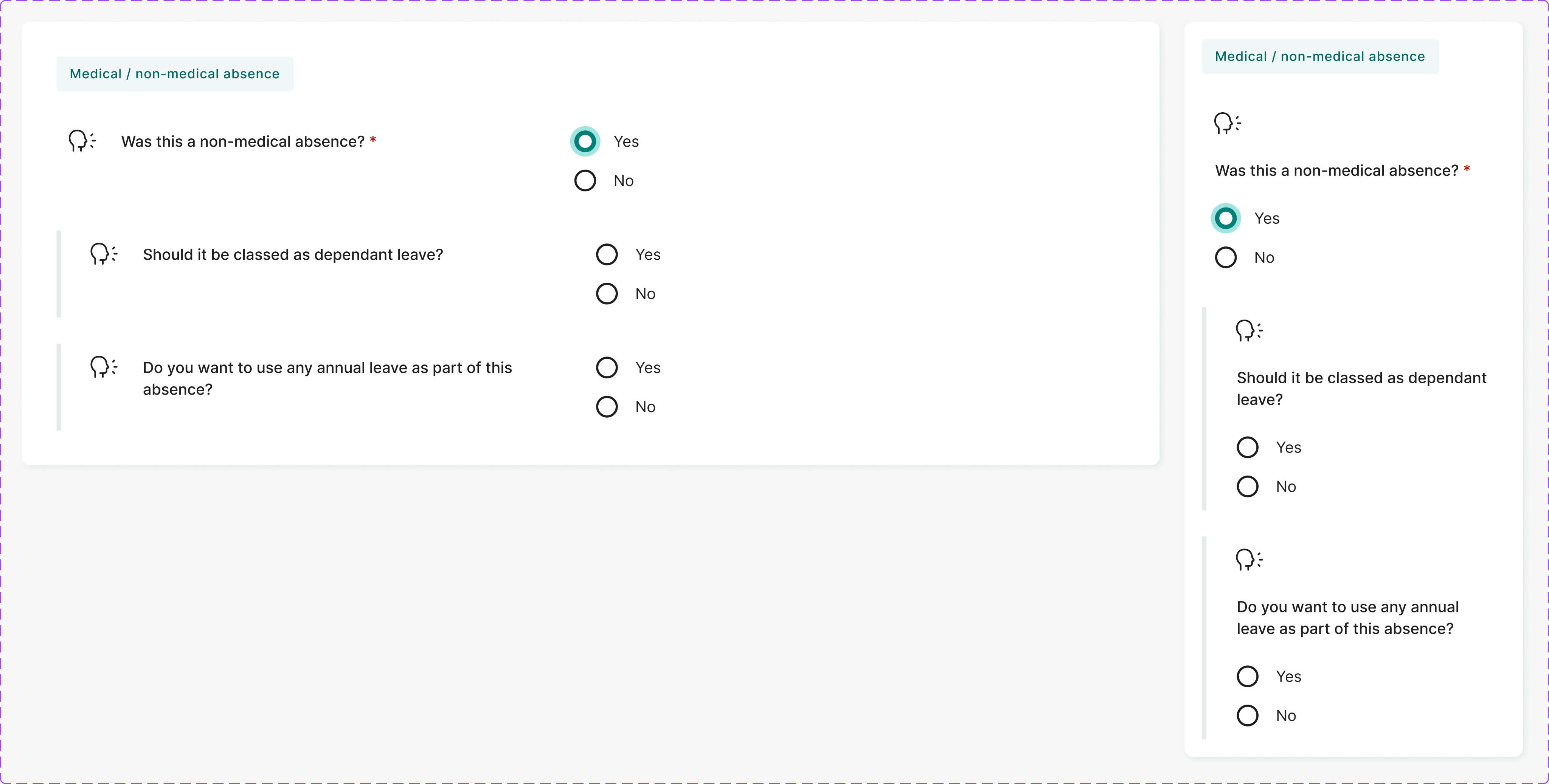
The redesigned fieldset component brings section labels into the interface rather than keeping them hidden in the admin area. A left-hand border indicates nesting, and the layout adapts to mobile by stacking fields vertically.
03

Build once, reuse everywhere
Breaking forms into clearly defined sections created a natural rhythm. Instead of facing one long, unpredictable flow of questions, users could complete one section at a time, building confidence as they progressed through the form. Solving the pattern once meant new forms could be assembled from reusable building blocks and users don’t have to learn the quirks of the new form.
That consistency extended beyond design. Each component was implemented in code and added to a shared component library, creating a common language between design and engineering.
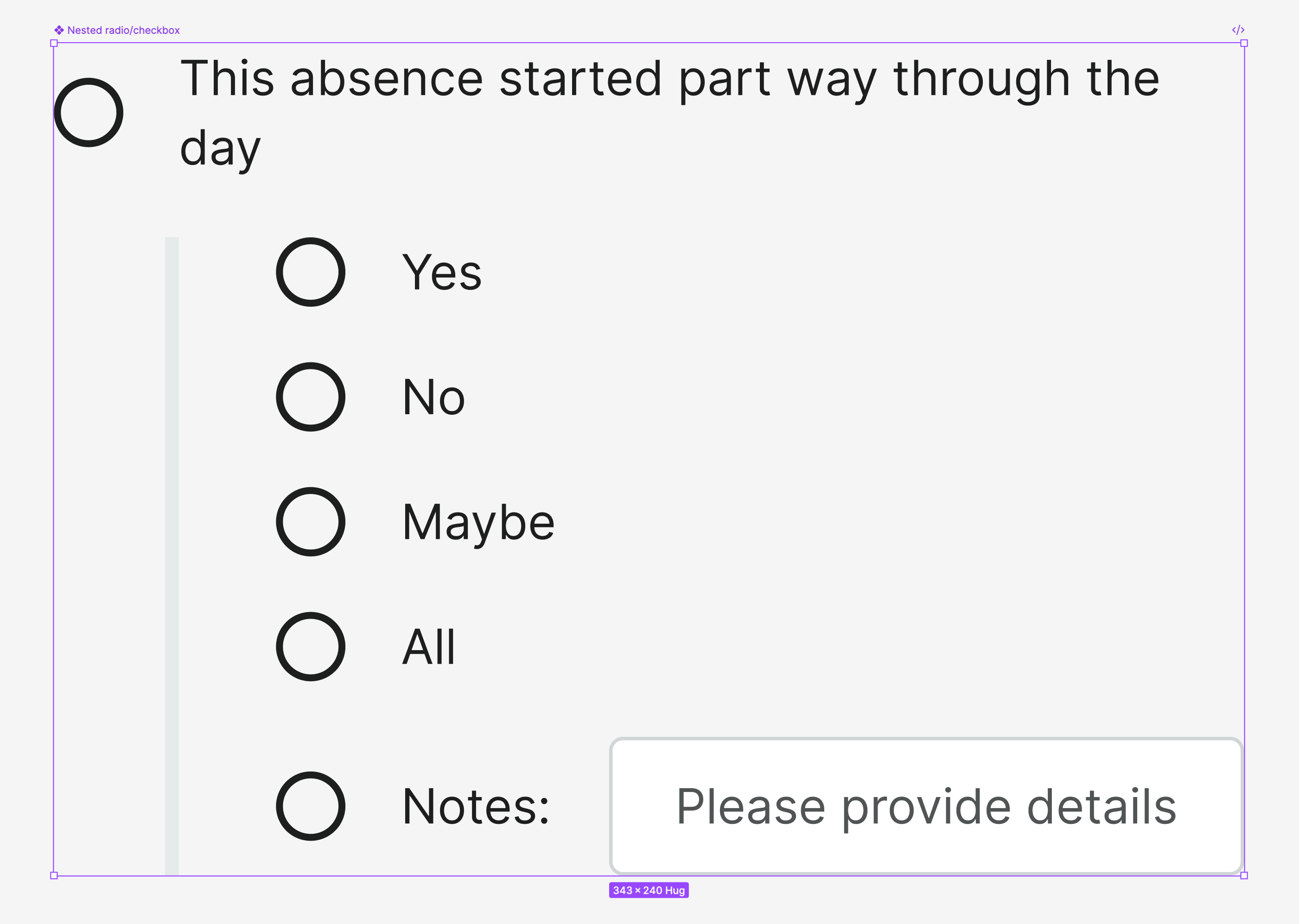
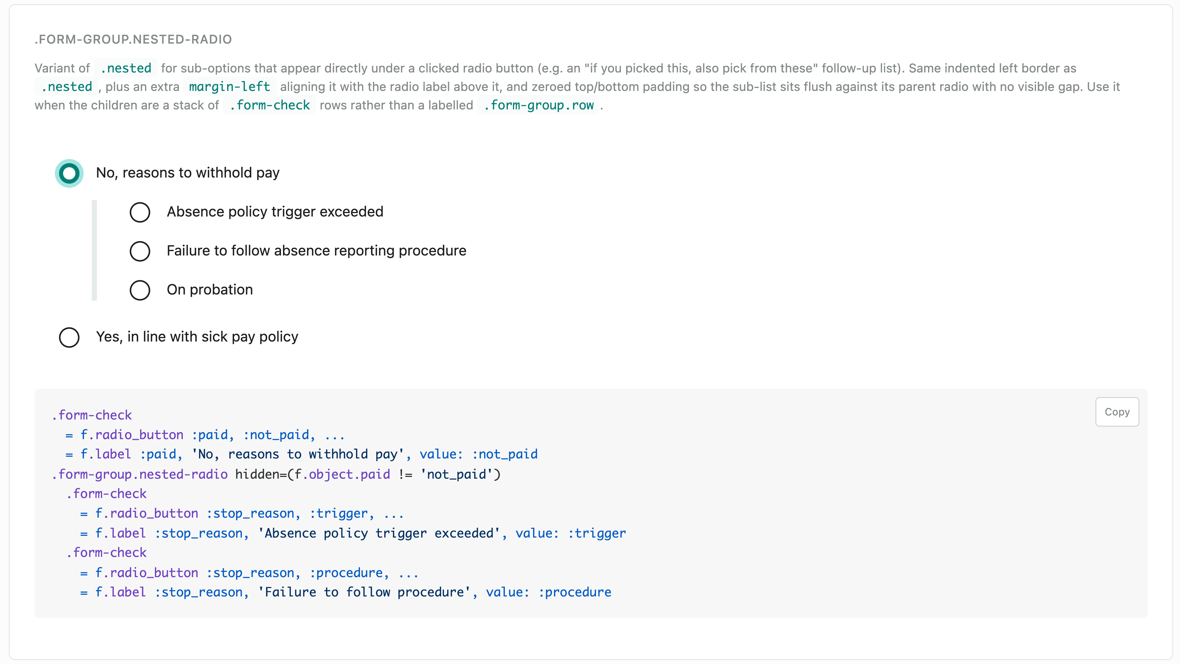
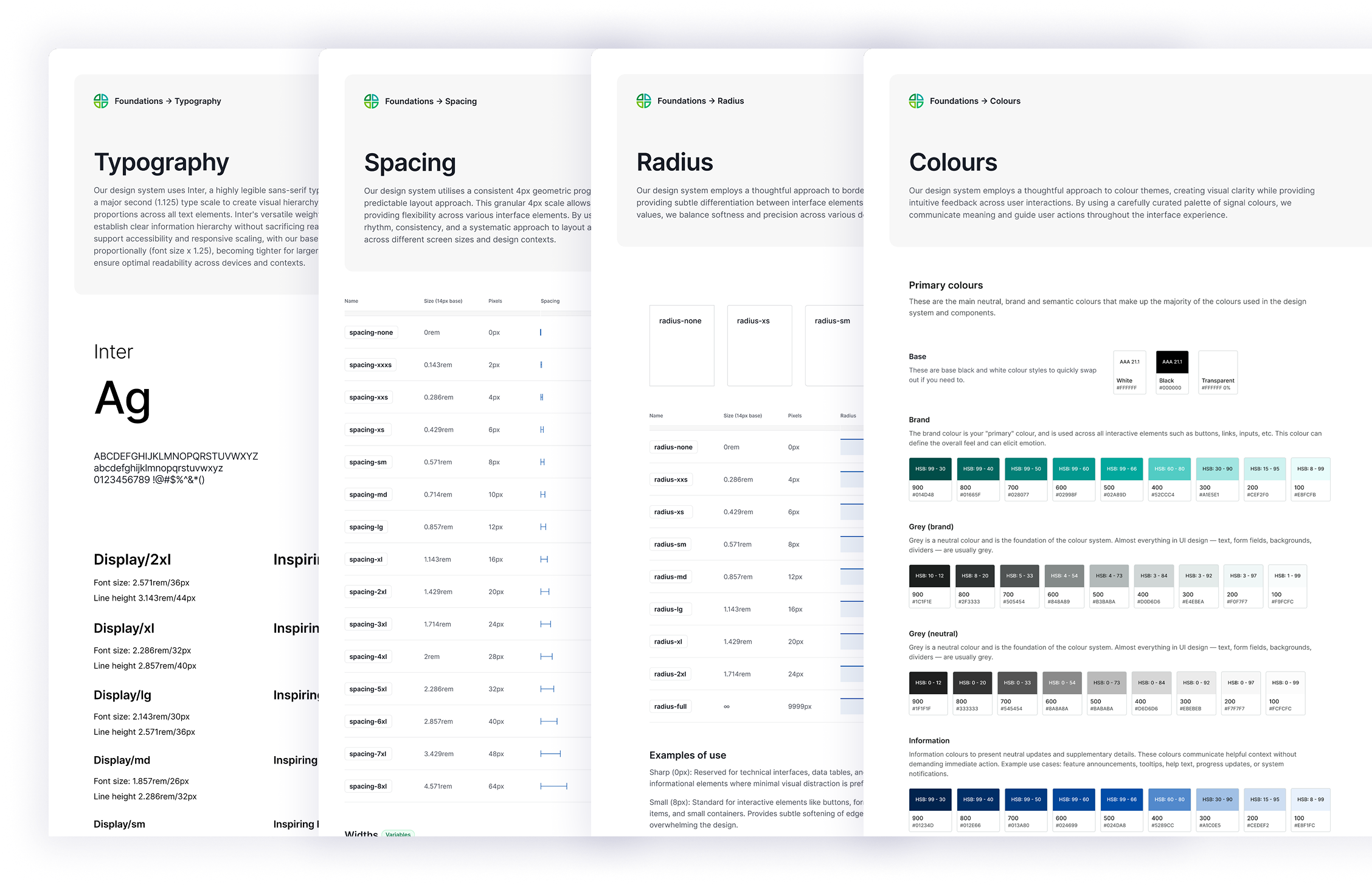
Components designed in Figma and documented in the design system by me (left), with implementation guidance maintained separately in the developer documentation by devs (right).
As more of the interface adopted the component library, the benefits extended beyond design. A backend-focused developer, who rarely worked on the front end, was able to build new forms using the shared components with minimal design input. The same patterns were being used by both design and engineering, making implementation more predictable.
04

Beyond components
Reusable components solved one part of the problem. As the library grew, the bigger challenge became governance—making it easy for everyone on the team to make consistent decisions without needing to remember every design rule.
As the redesign progressed, patterns of use naturally emerged. Certain shades consistently became the default for borders, subtle surfaces, badges and supporting text. The palette was easy enough to learn, but using it still relied on remembering which shade had become the convention. As the system grew, I found myself asking, "Was it Grey 300 or Grey 400 for borders?"
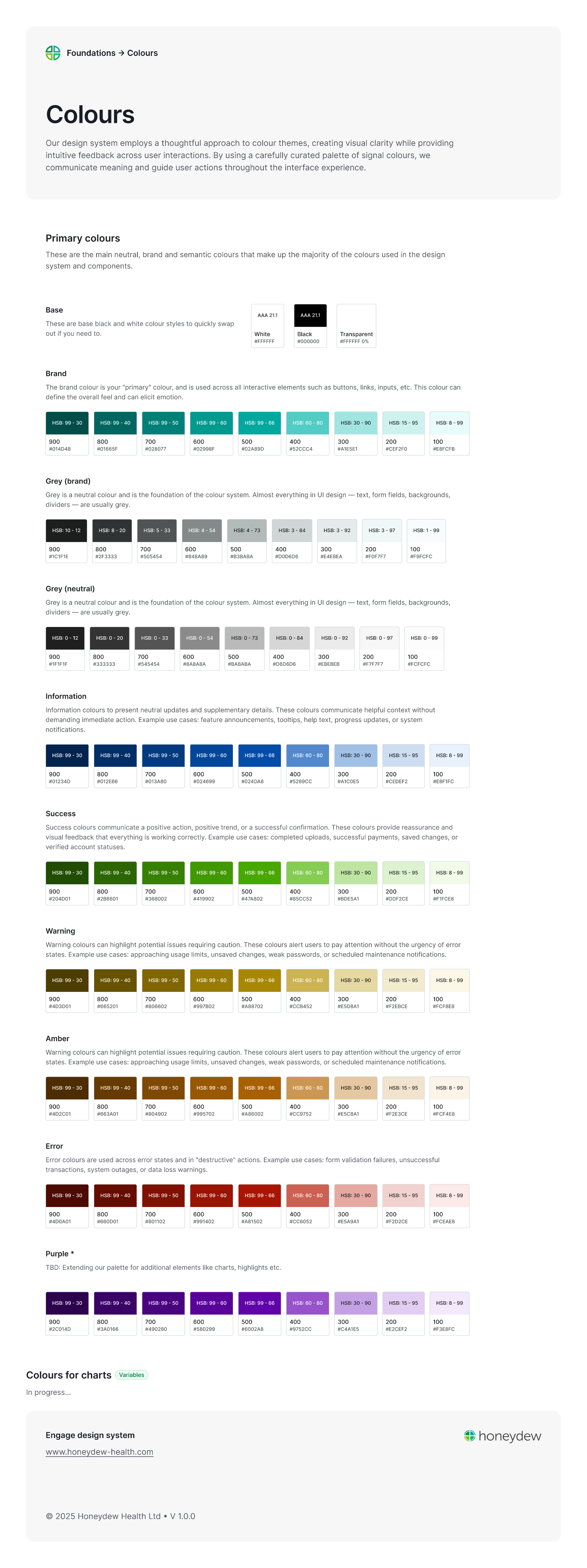
A nine-shade grey palette tinted with the brand colour. The subtle differences between shades are difficult to distinguish when used for borders.
This was my sign that the palette had outgrown its purpose. I dedicated time to consolidating those design decisions and translating them into semantic tokens. Instead of remembering colours, me and my team now think in intent. The Figma files also became far easier to read, with every colour communicating its purpose rather than its appearance.
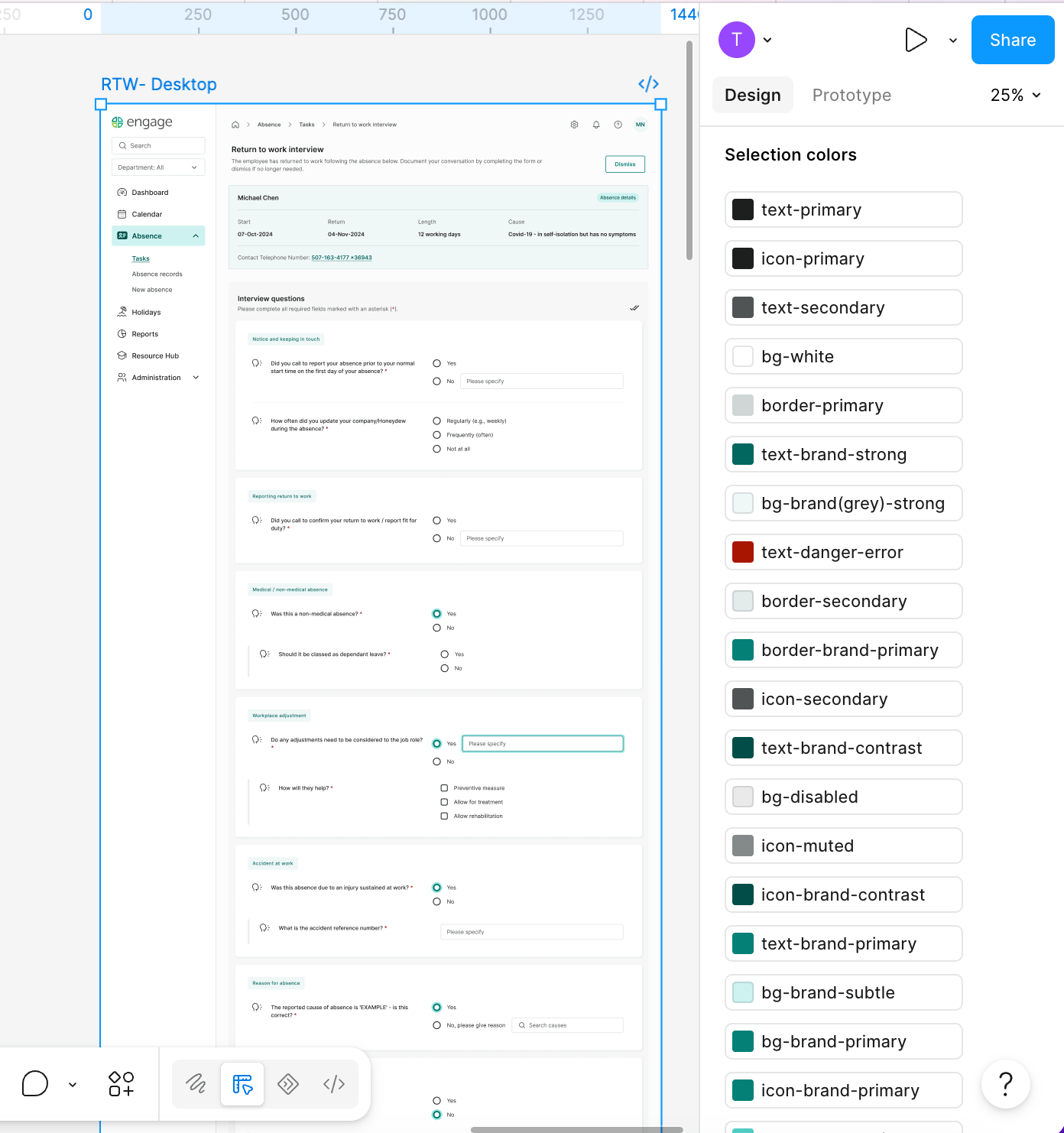
Colour tokens (variables) applied to a design are visible when the frame is selected.
A border is simply border-primary, a subtle surface becomes bg-brand-grey-subtle, headings use text-primary, and body copy uses text-secondary. Although the underlying palette expanded, the number of design decisions reduced dramatically. Most tasks now involve choosing between two or three semantic options rather than searching through the entire palette, making the system easier to learn, more consistent to apply and simpler to maintain.

WHAT CHANGED?
Speed of design & development
200+ to
minutes
and long calls
from
manual checks to
30
.
Less repetitive work, more room to think
Systematising the patterns I'd been creating took dedicated time upfront, but it paid off. Reusable components made designing screens faster, while connecting Figma to AI-assisted development meant engineers could turn designs into working pages with minimal UI adjustments. This reduced the time spent recreating and correcting patterns, leaving more room for research, validation and considered product decisions.
More from my time at Honeydew
Other work happened concoruently.
That’s a little about me and how I work
If you’d like to work together, compare notes or talk through a tricky product problem, you can find me at
TOOCH

© 2026 TUGCE GUNGORMEZLER

Product designer
Oxfordshire, UK
Remote-first, happy to travel for workshops and team sessions
TOOCH
Projects
Engage Design System
Two weeks for the foundations. Twelve months to prove the value.
Component library
Design system
Documentation
Figma
Dev hand-off
ROLE
Sole product designer
TEAM
Engineer and me
USERS
The product trio, augmented by Claude
SCOPE
Variables, tokens, components, templates
TIMELINE
Nov 2025
THE CONTEXT
Engineering identified growing technical risk in the 12-year-old product and proposed a year-long modernisation initiative.
Alongside migrating the front end to Bootstrap, I was the sole designer responsible for redesigning the product while simultaneously creating the design system that would support it.
The first piece of the puzzle
Forms were the backbone of Engage, supporting everything from absence reporting to occupational health assessments. As the most frequently used part of the platform, they offered the greatest opportunity to improve UX and establish reusable design patterns for the wider system.
01
Taming unpredictable forms
The existing forms were largely unstyled HTML, with little visual hierarchy or structure. As users answered questions, additional fields would appear without any indication of why they had been revealed or how they related to the previous answer. The form continuously changed shape, making it difficult to understand what had triggered new questions or when a section was actually complete.
Example of a nested question in the legacy system, with no visual indication of its hierarchy and an inappropriate use of checkboxes.
02
Designing how forms behave
Rather than redesigning individual forms, I focused on designing how forms behave. By identifying the structure shared across every workflow, I created a flexible fieldset component that introduced section labels, grouped related questions and established a clear pattern for conditional inputs. Nested questions were visually connected to their parent using a vertical guide, making it immediately obvious when an answer had triggered additional information.
The redesigned fieldset component brings section labels into the interface rather than keeping them hidden in the admin area. A left-hand border indicates nesting, and the layout adapts to mobile by stacking fields vertically.
03
Build once, reuse everywhere
Breaking forms into clearly defined sections created a natural rhythm. Instead of facing one long, unpredictable flow of questions, users could complete one section at a time, building confidence as they progressed through the form. Solving the pattern once meant new forms could be assembled from reusable building blocks and users don’t have to learn the quirks of the new form.
That consistency extended beyond design. Each component was implemented in code and added to a shared component library, creating a common language between design and engineering.
Components designed in Figma and documented in the design system by me (left), with implementation guidance maintained separately in the developer documentation by devs (right).
As more of the interface adopted the component library, the benefits extended beyond design. A backend-focused developer, who rarely worked on the front end, was able to build new forms using the shared components with minimal design input. The same patterns were being used by both design and engineering, making implementation more predictable.
04
Beyond components
Reusable components solved one part of the problem. As the library grew, the bigger challenge became governance—making it easy for everyone on the team to make consistent decisions without needing to remember every design rule.
As the redesign progressed, patterns of use naturally emerged. Certain shades consistently became the default for borders, subtle surfaces, badges and supporting text. The palette was easy enough to learn, but using it still relied on remembering which shade had become the convention. As the system grew, I found myself asking, "Was it Grey 300 or Grey 400 for borders?"
A nine-shade grey palette tinted with the brand colour. The subtle differences between shades are difficult to distinguish when used for borders.
This was my sign that the palette had outgrown its purpose. I dedicated time to consolidating those design decisions and translating them into semantic tokens. Instead of remembering colours, me and my team now think in intent. The Figma files also became far easier to read, with every colour communicating its purpose rather than its appearance.
Colour tokens (variables) applied to a design are visible when the frame is selected.
A border is simply border-primary, a subtle surface becomes bg-brand-grey-subtle, headings use text-primary, and body copy uses text-secondary. Although the underlying palette expanded, the number of design decisions reduced dramatically. Most tasks now involve choosing between two or three semantic options rather than searching through the entire palette, making the system easier to learn, more consistent to apply and simpler to maintain.
WHAT CHANGED?
Speed of design & development
from half a day to
minutes
design consistency
manual checks to
claude one shotting it
.
Less repetitive work, more room to think
Systematising the patterns I'd been creating took dedicated time upfront, but it paid off. Reusable components made designing screens faster, while connecting Figma to AI-assisted development meant engineers could turn designs into working pages with minimal UI adjustments. This reduced the time spent recreating and correcting patterns, leaving more room for research, validation and considered product decisions.
More from my time at Honeydew
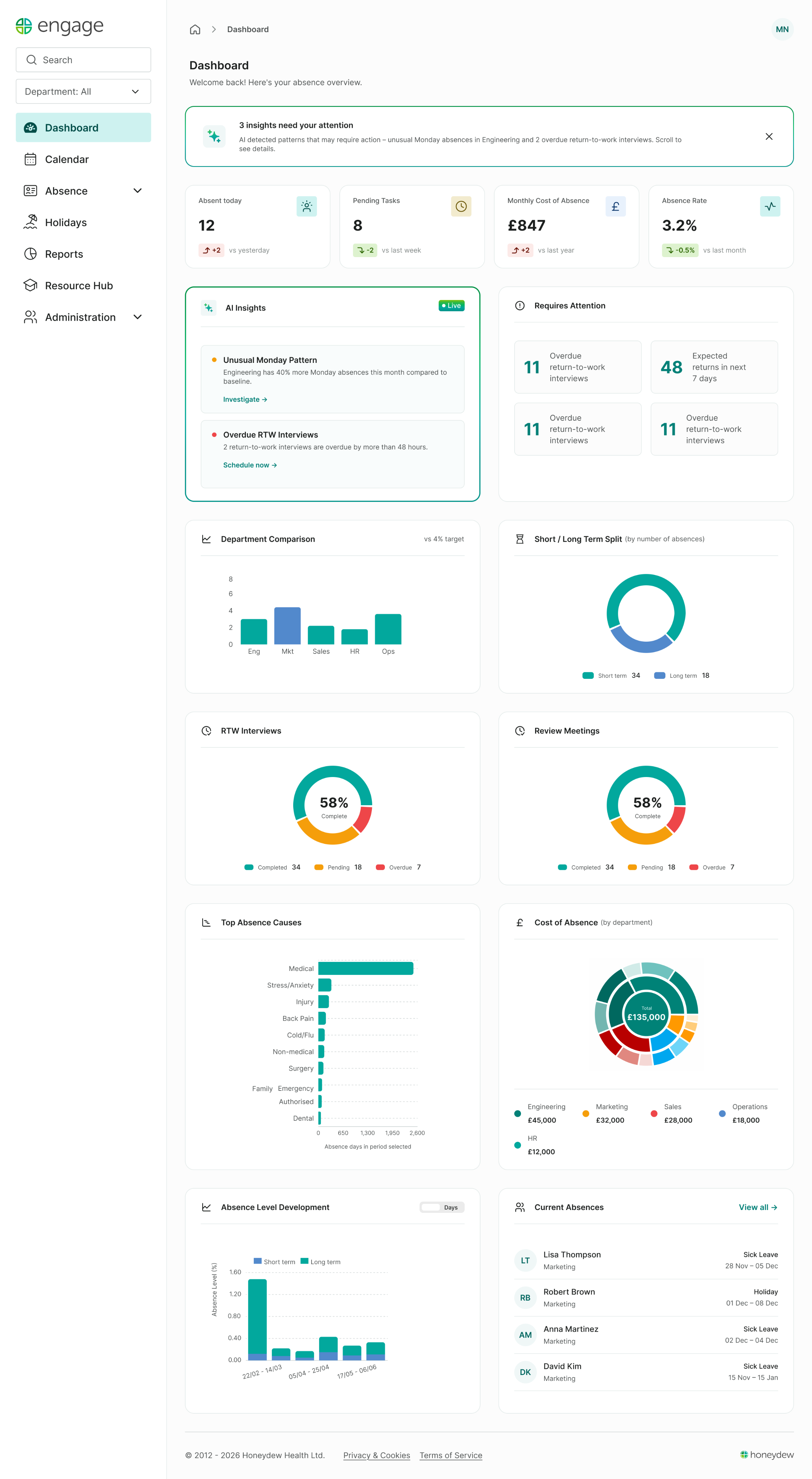
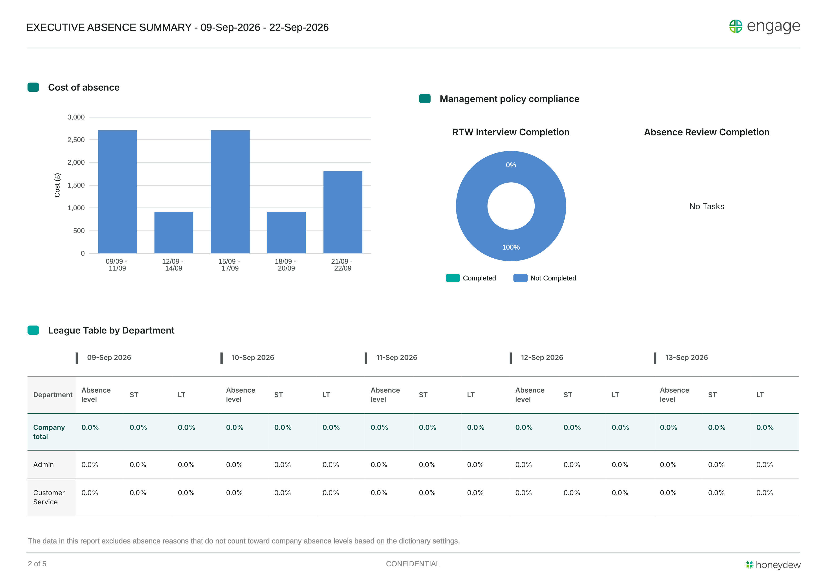
Beyond this project, I also worked on Honeydew’s brand identity and the wider redesign.

Engage 3.0: Redesign
Setting up Engage's first design system: foundations, components and documentation, built alongside the redesign.
16
usability sessions
10+
workshops
100+
screens designed
12+ months
Solo designer
UAT
Figma


Honeydew Brand Refresh
Evolving Honeydew’s identity into a cohesive brand family, refining the logo and building shared guidelines and assets.
30+
guideline pages
10+
templates
3
identities using the system
Brand strategy
Logo design
Brand guidelines
Asset library
That’s a little about me and how I work
If you’d like to work together, compare notes or talk through a tricky product problem, you can find me at
TOOCH

© 2026 TUGCE GUNGORMEZLER
Product designer
Oxfordshire, UK
Remote-first, happy to travel for workshops and team sessions