TOOCH
Projects
Contact me
CV
Bringing the family together: From logo refresh to a shared visual language
A melon slice, a cross, a hint at workplace wellness. The foundation was strong — the family just needed to match.
Brand strategy
Logo design
Brand guidelines
Asset library
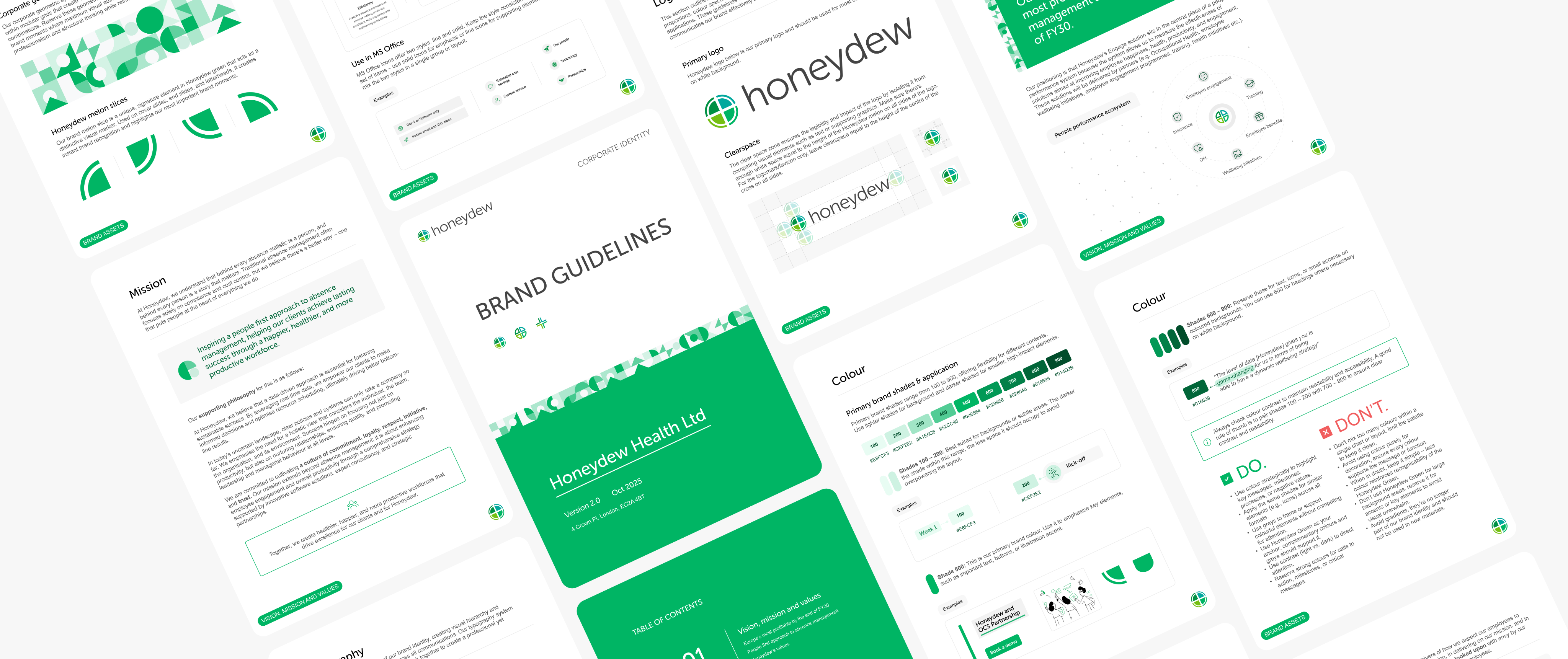
30+ page brand guide · 10+ reusable templates and assets · Honeydew, Engage & Resolve
THE CHALLENGE
Honeydew had evolved over time, with individual product logos created independently. The result was a brand family with inconsistencies in colour, proportions and construction, and little visual hierarchy between the corporate and product brands.
The brief was to strengthen the existing identity without losing the recognition customers had built over the years.



The first ask: the logo
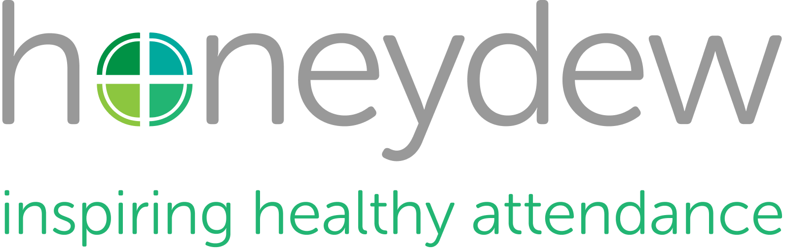
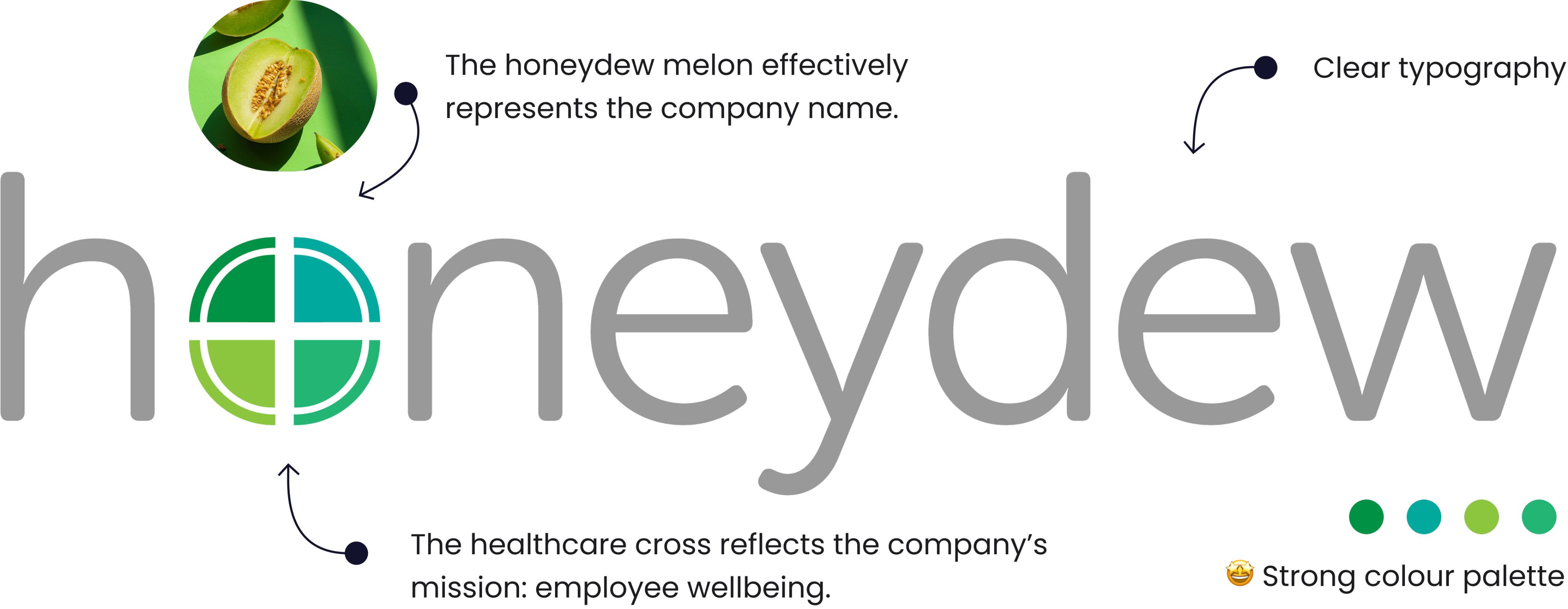
The original Honeydew logo had a clever idea — melon slices forming a cross inside the "o", hinting at workplace wellness. But sitting inside the letterform, it competed with the wordmark rather than enhancing it.
01
Freeing the melon
Pulling the melon out of the "o" let the type breathe and unlocked an independent brand mark — usable on its own, making the lockup far more flexible.

02
Finding colour harmony
Now that the melon is out of the wordmark, the wordmark can have a stronger presence with a darker shade. The melon's greens were nice, but one stood out from the pack. It came down to standardising the HSB values to bring coherence to the slices.
* Hue was preserved to maintain brand recognition, while saturation and brightness were aligned within a 10+ point range to create a more cohesive palette.

H
S
B
before

after
148
100
57
176
100

99
66
86
68
90
78
75
153
81
100
71
03
Constructing the melon
Small changes in proportion can significantly affect how a mark feels. I explored multiple relationships between the outer circle, inner cross and stroke weights, comparing them across a range of sizes.
32 px
28 px
26 px


Outer ring at 1px

1:2
1:3
1:4


Crosses at 2px, 3px, and 4px
32 px
28 px
24 px


Outer ring at 2px

2:2
2:3
2:4


Crosses at 2px, 3px, and 4px
04
Refining the proportions
At this scale, small changes to the melon mattered: some made the cross too dominant, others weakened the ring or made the logo feel heavy. The final 2:3 proportion gave the mark enough presence without competing with the wordmark, while remaining legible at smaller sizes.
1:2

honeydew

Cross loses definition
1:3

honeydew
Ring becomes visually weak
1:4

honeydew
Cross dominates the mark
2:2

honeydew
Logo feels visually heavy
2:3

honeydew
Balanced weight and strong legibility

2:4

honeydew
Cross begins to overpower the ring
Putting the identity to work
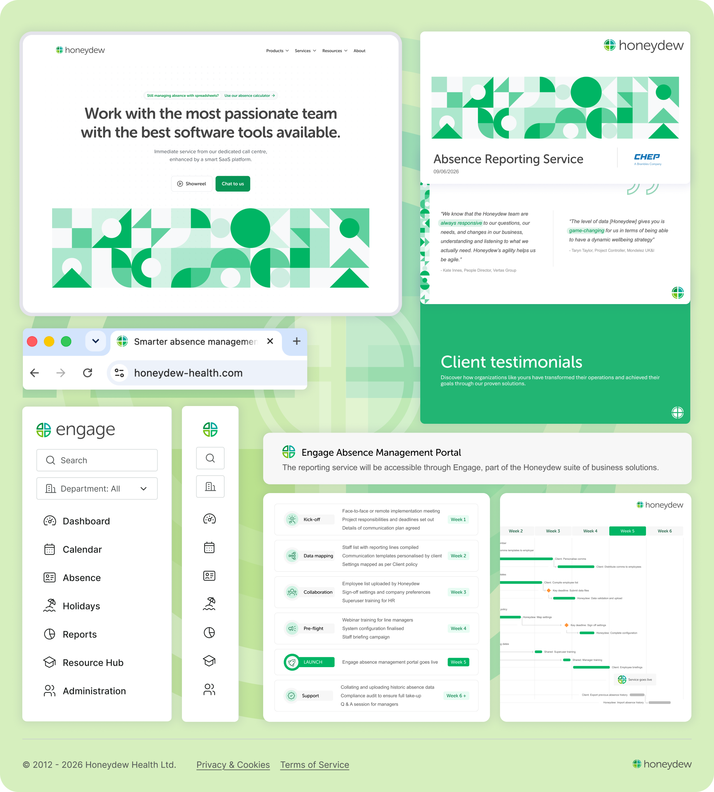
The refreshed identity needed to work in the places people actually encountered Honeydew—not just in the logo. I applied the new visual language across product, presentations, documents and brand assets, using the same core elements in different ways.
Project in numbers
30+ guideline pages
,10+ templates
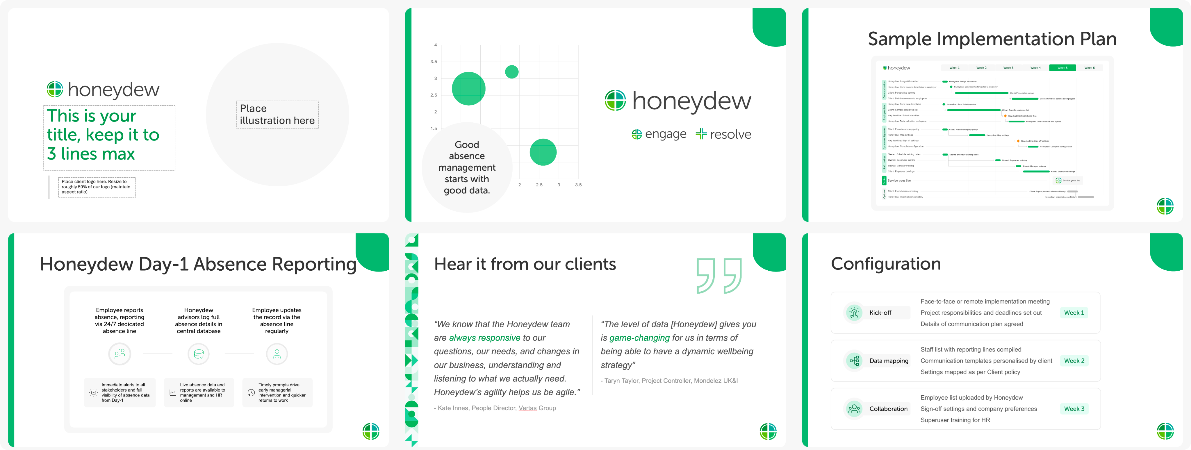
,and 3 identities

— all speaking
1
visual language.
See more
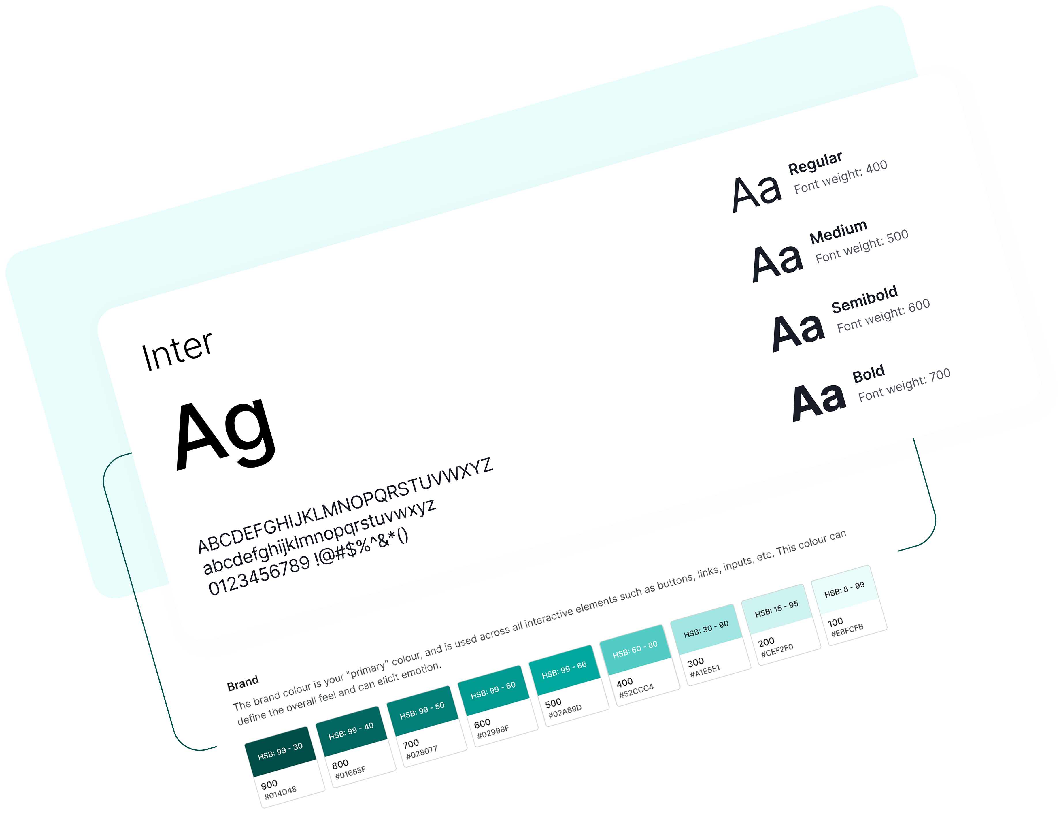
Engage Design System
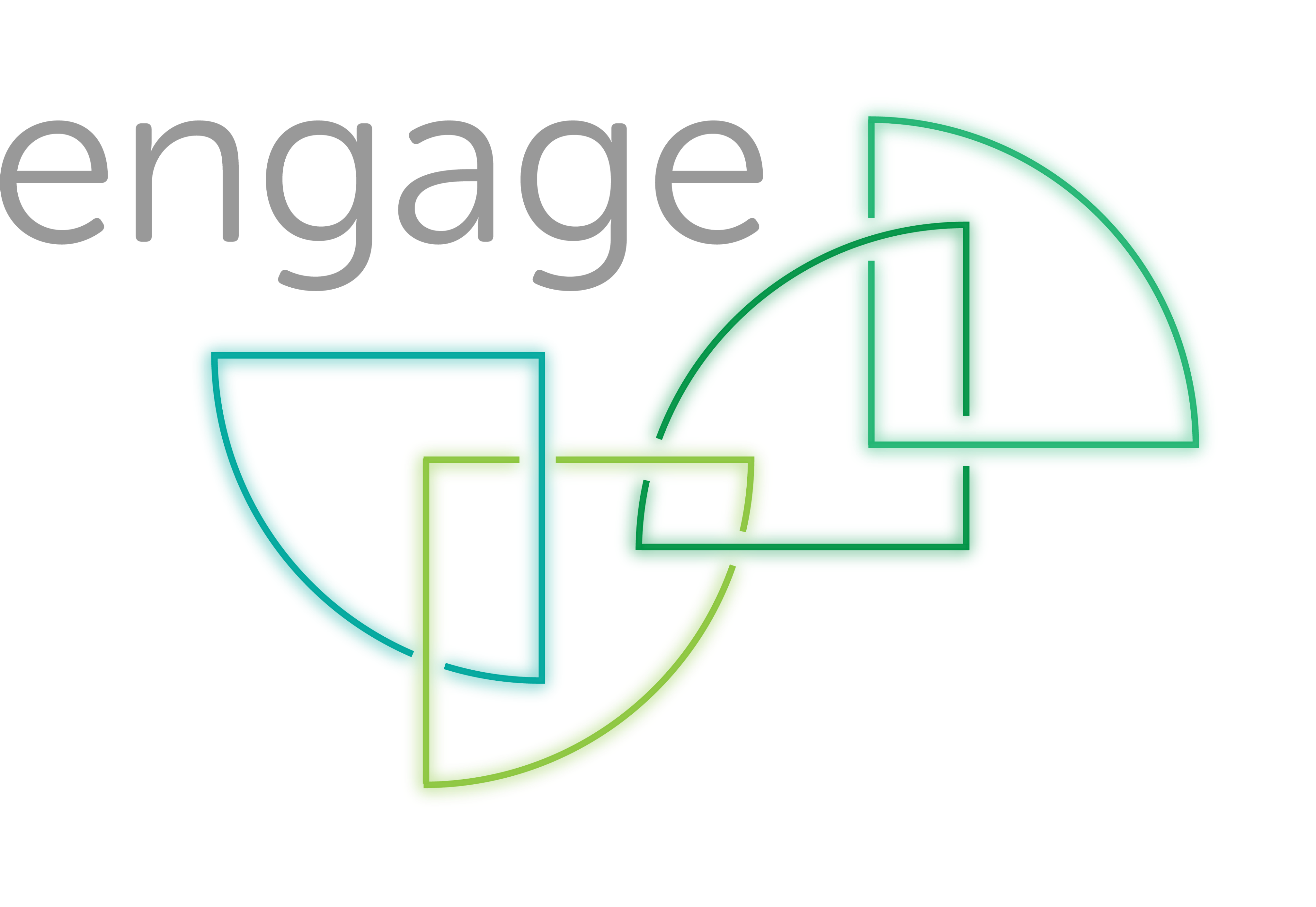
Setting up Engage's first design system: foundations, components and documentation, built alongside the redesign.
7
foundations
50+
components
100+
screens using the system
10+
forms rebult
Design systems
Component library
Documentation
Figma
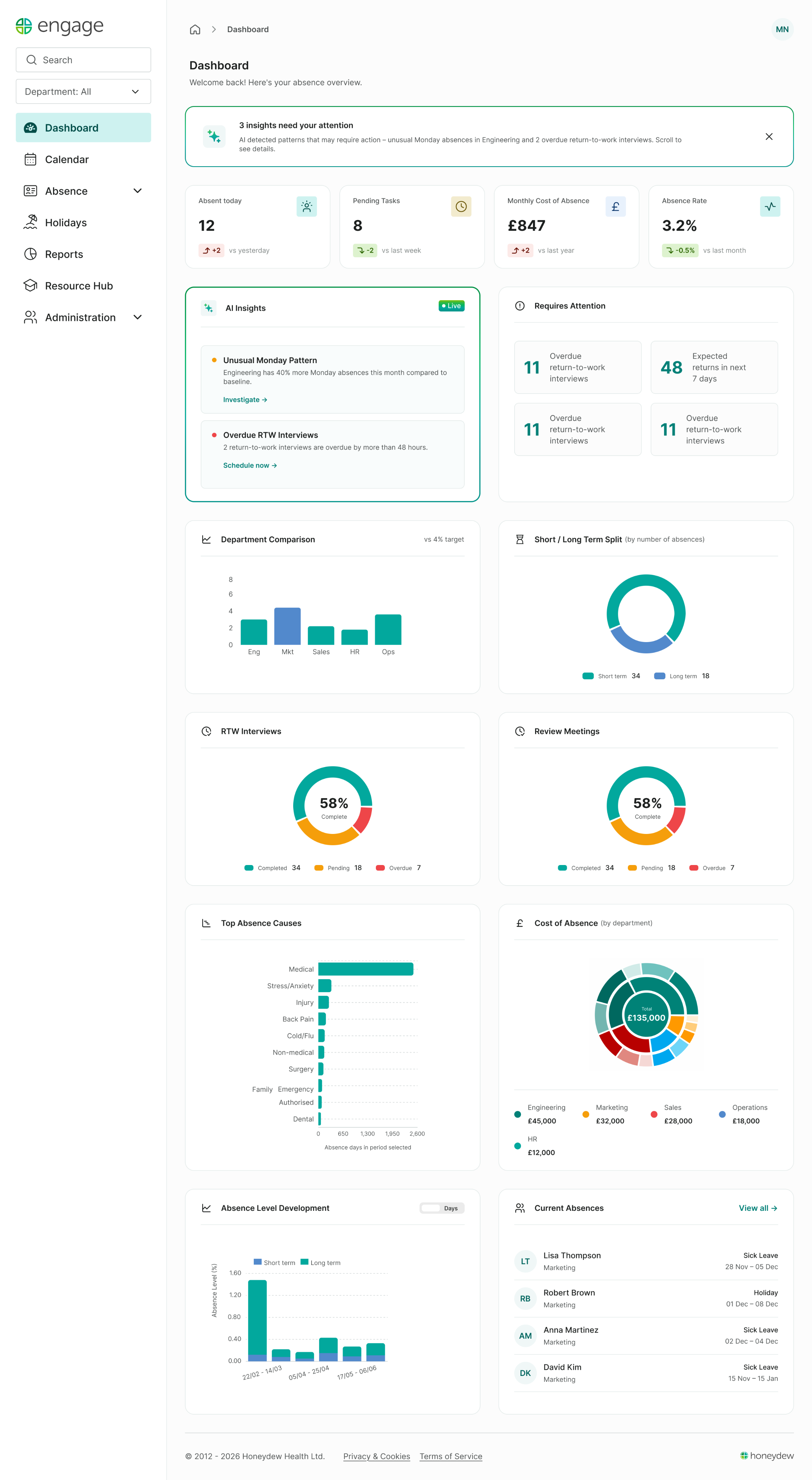


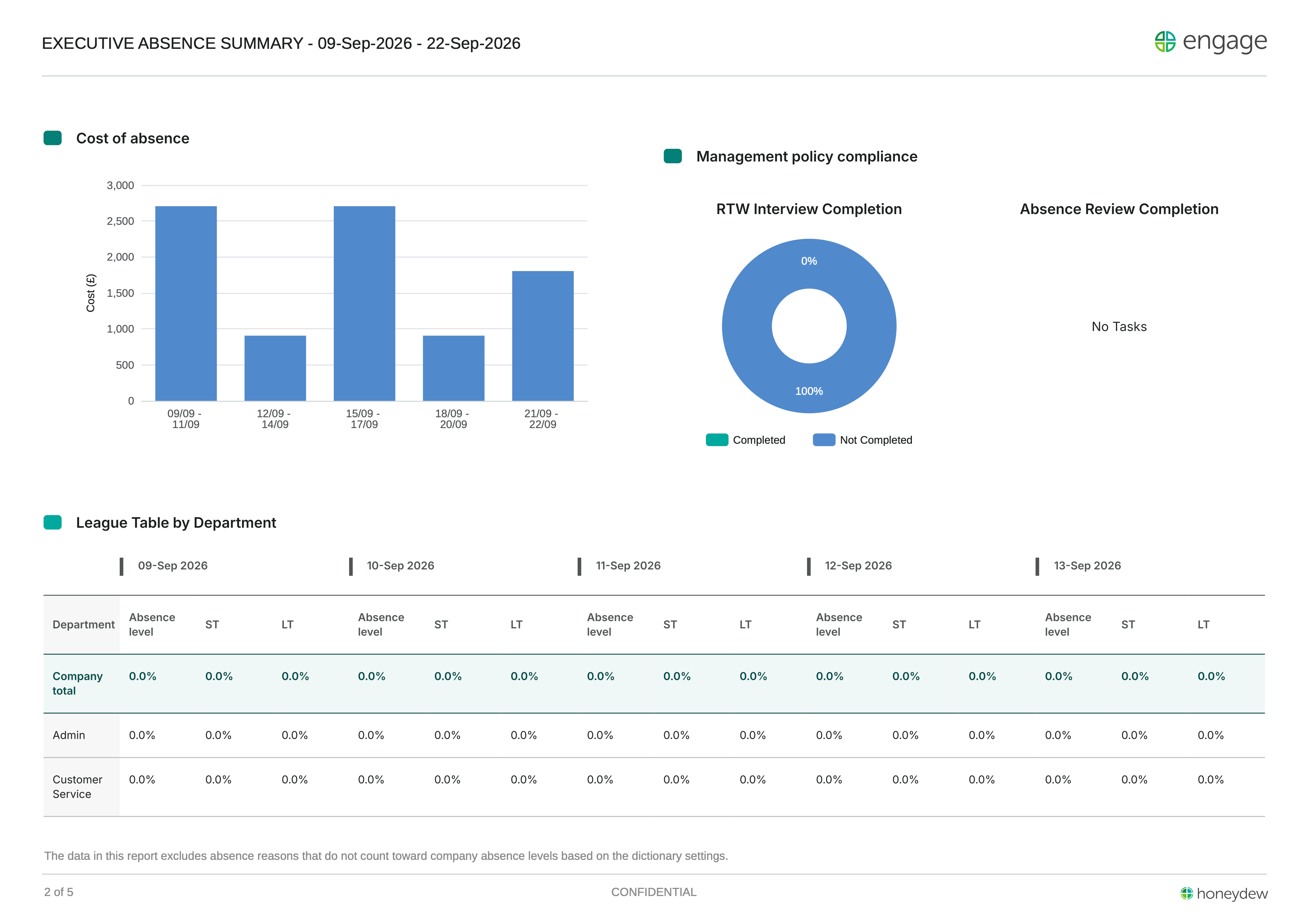
Engage 3.0: The Next Chapter
Setting up Engage's first design system: foundations, components and documentation, built alongside the redesign.
10+
Users
100+
screens designed
7
Usability testing sessions
50+
UAT
Design systems
Component library
Documentation
Figma
Engage 3.0: The Next Chapter
Setting up Engage's first design system: foundations, components and documentation, built alongside the redesign.
7
foundations
50+
components
100+
screens using the system
10+
forms rebult
Design systems
Component library
Documentation
Figma
TOOCH
All rights reserved
TOOCH
Projects
Contact me
CV
Bringing the family together: From logo refresh to a shared visual language
A melon slice, a cross, a hint at workplace wellness. The foundation was strong — the family just needed to match.
Brand strategy
Logo design
Brand guidelines
Asset library
30+ page brand guide · 10+ reusable templates and assets · Honeydew, Engage & Resolve
THE CHALLENGE
Honeydew had evolved over time, with individual product logos created independently. The result was a brand family with inconsistencies in colour, proportions and construction, and little visual hierarchy between the corporate and product brands.
The brief was to strengthen the existing identity without losing the recognition customers had built over the years.
The first ask: the logo
The original Honeydew logo had a clever idea — melon slices forming a cross inside the "o", hinting at workplace wellness. But sitting inside the letterform, it competed with the wordmark rather than enhancing it.
01
Freeing the melon
Pulling the melon out of the "o" let the type breathe and unlocked an independent brand mark — usable on its own, making the lockup far more flexible.
02
Finding colour harmony
Now that the melon is out of the wordmark, the wordmark can have a stronger presence with a darker shade. The melon's greens were nice, but one stood out from the pack. It came down to standardising the HSB values to bring coherence to the slices.
* Hue was preserved to maintain brand recognition, while saturation and brightness were aligned within a 10+ point range to create a more cohesive palette.
H
S
B
before
after
148
100
57
176
100
99
66
86
68
90
78
75
153
81
100
71
03
Constructing the melon
Small changes in proportion can significantly affect how a mark feels. I explored multiple relationships between the outer circle, inner cross and stroke weights, comparing them across a range of sizes.
32 px
28 px
26 px
Outer ring at 1px
1:2
1:3
1:4
Crosses at 2px, 3px, and 4px
32 px
28 px
24 px
Outer ring at 2px
2:2
2:3
2:4

Crosses at 2px, 3px, and 4px
04
Refining the proportions
At this scale, small changes to the melon mattered: some made the cross too dominant, others weakened the ring or made the logo feel heavy. The final 2:3 proportion gave the mark enough presence without competing with the wordmark, while remaining legible at smaller sizes.
1:2
honeydew
Cross loses definition
1:3
honeydew
Ring becomes visually weak
1:4
honeydew
Cross dominates the mark
2:2
honeydew
Logo feels visually heavy
2:3
honeydew
Balanced weight and strong legibility
2:4
honeydew
Cross begins to overpower the ring
Putting the identity to work
The refreshed identity needed to work in the places people actually encountered Honeydew—not just in the logo. I applied the new visual language across product, presentations, documents and brand assets, using the same core elements in different ways.
Project in numbers
30+ guideline pages
,10+ templates
,and 3 identities

— all speaking
1
visual language.
See more
Engage Design System
Setting up Engage's first design system: foundations, components and documentation, built alongside the redesign.
7
foundations
50+
components
100+
screens using the system
10+
forms rebult
Design systems
Component library
Documentation
Figma
Engage 3.0: The Next Chapter
Setting up Engage's first design system: foundations, components and documentation, built alongside the redesign.
10+
Users
100+
screens designed
7
Usability testing sessions
50+
UAT
Design systems
Component library
Documentation
Figma
Engage 3.0: The Next Chapter
Setting up Engage's first design system: foundations, components and documentation, built alongside the redesign.
7
foundations
50+
components
100+
screens using the system
10+
forms rebult
Design systems
Component library
Documentation
Figma
TOOCH
All rights reserved